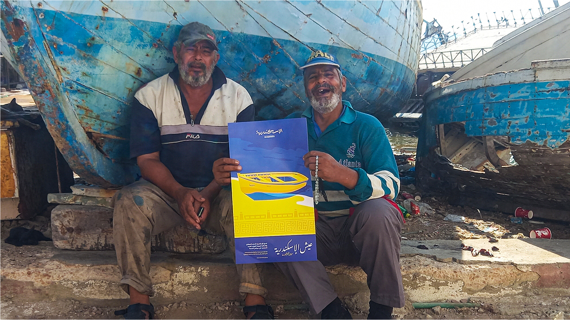
At the beginning of the project, we tried to understand what is Alexandria to the people who live in it or visit the city.
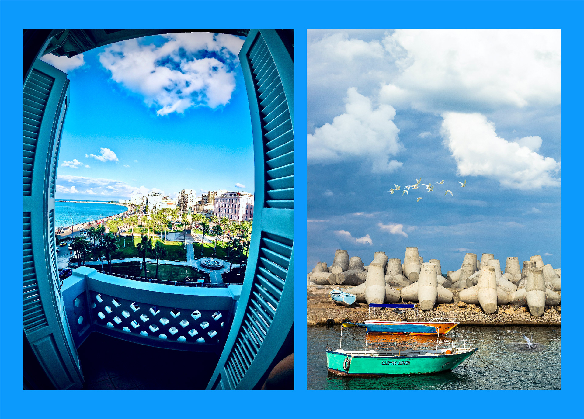
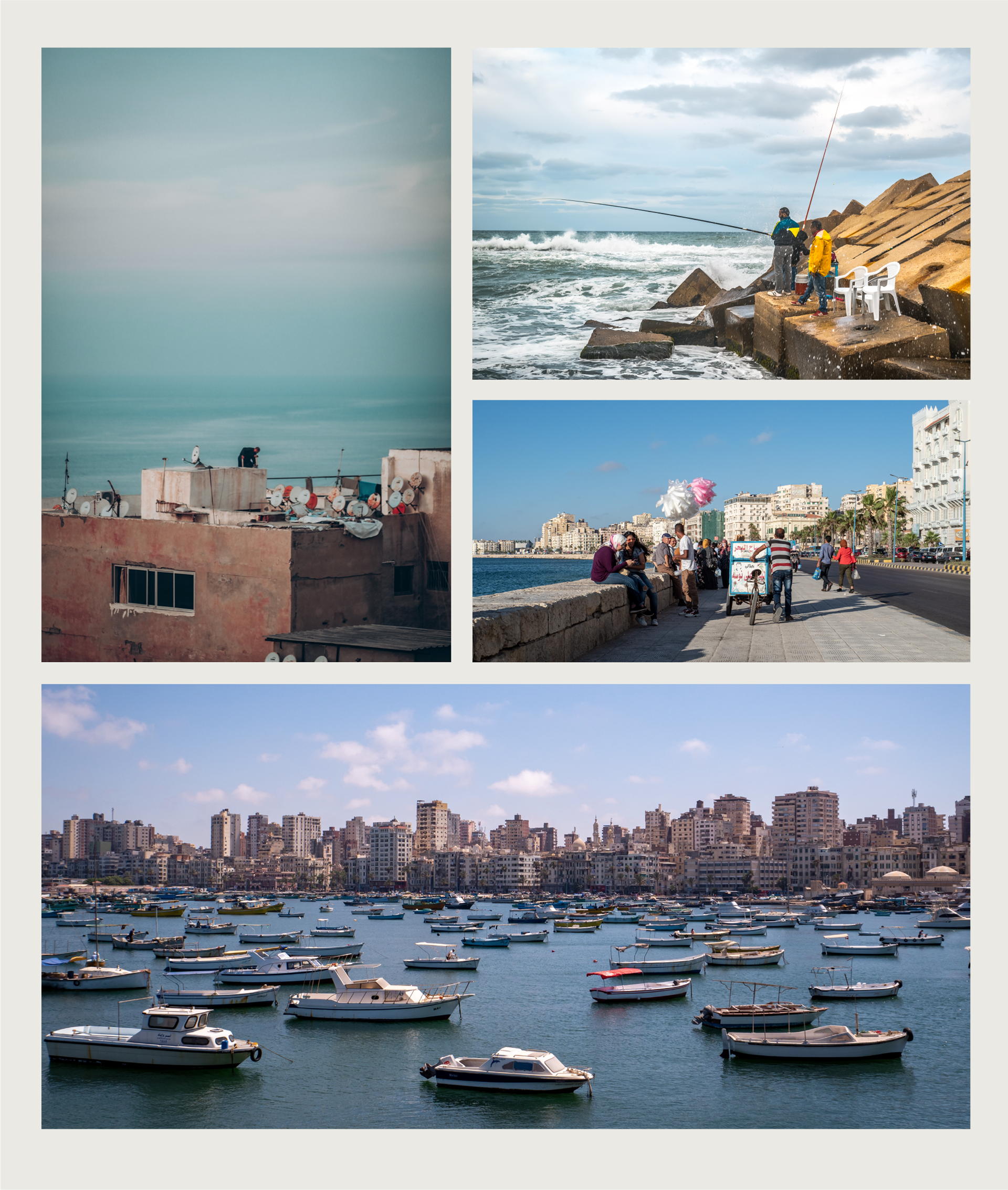
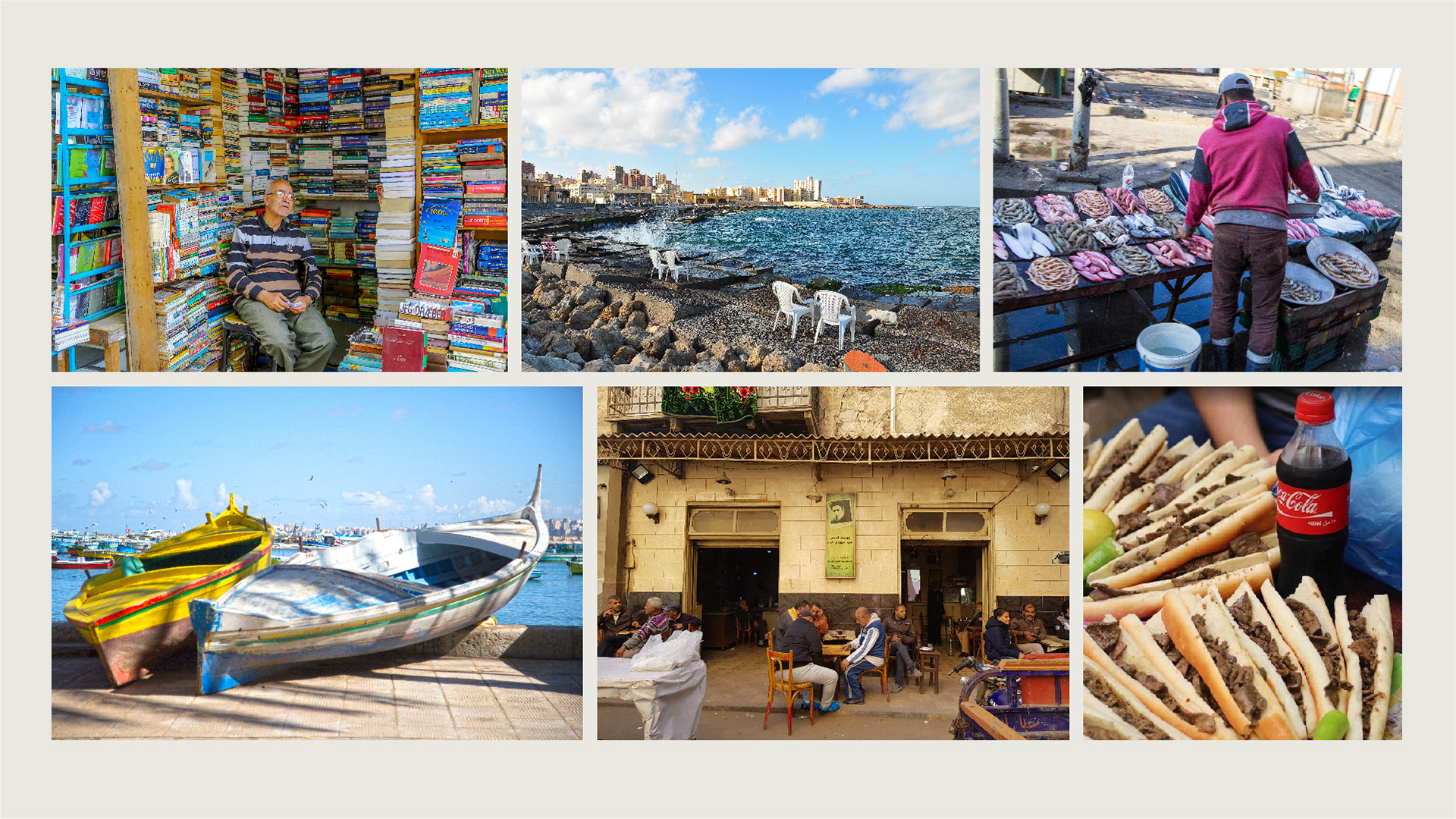
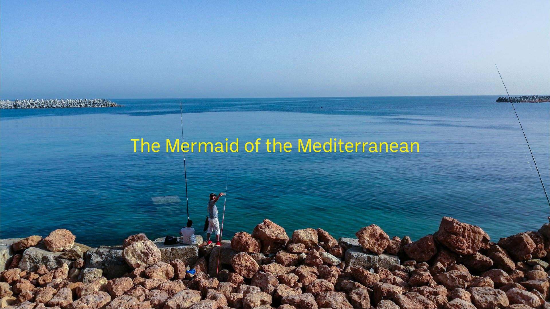
Egyptian and foreign visitors think of Alexandria as a fresh air city with beautiful sea sights. You can go there to relax, empty your mind in front of the sea, and enjoy a delicious meal of fish, seafood, or liver in the Alexandrian way.
People saw Alexandria’s brand as an experience, and feelings more than just some monuments or beaches. Most of the Egyptians have their memories and experiences in the city.
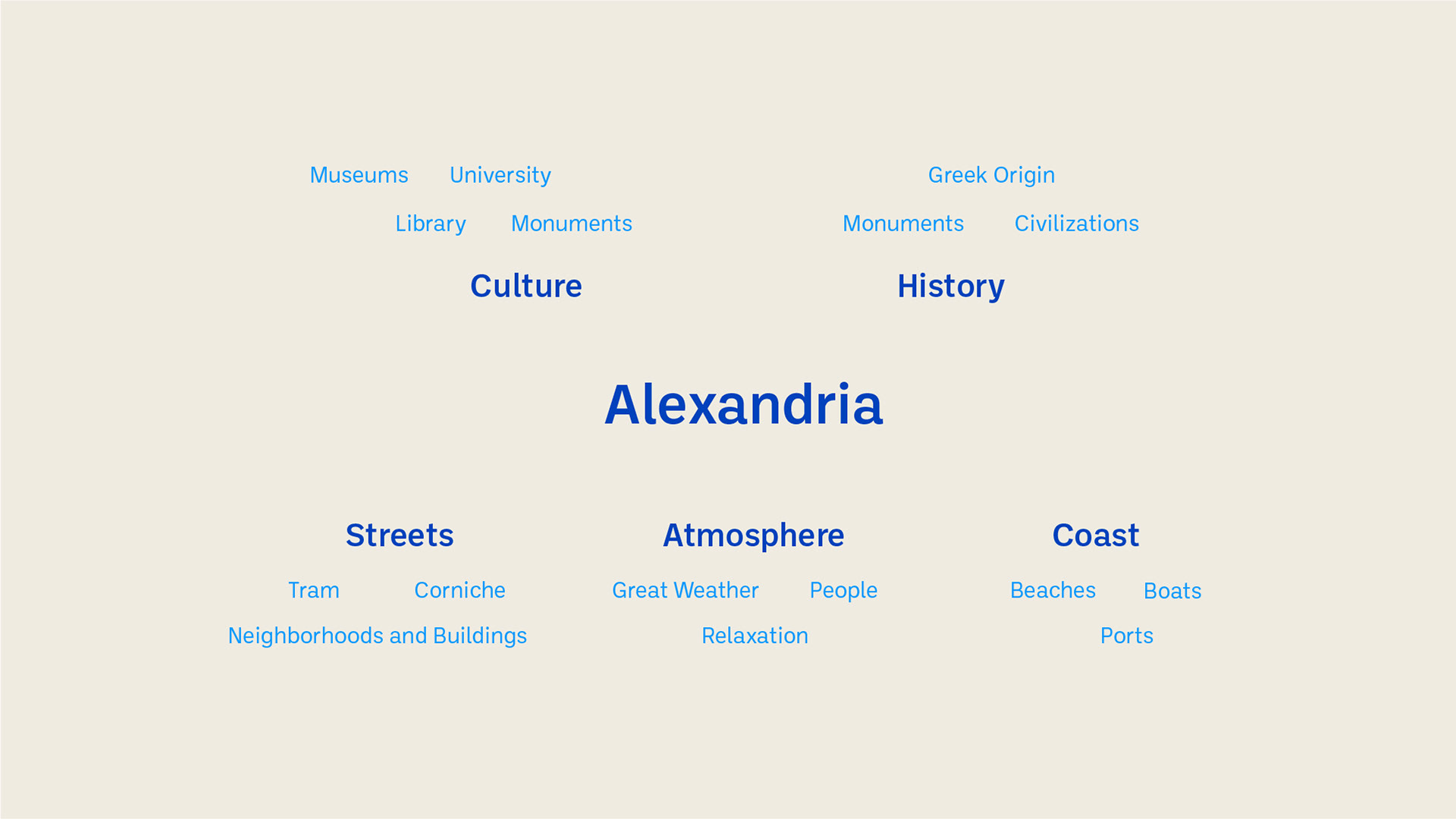
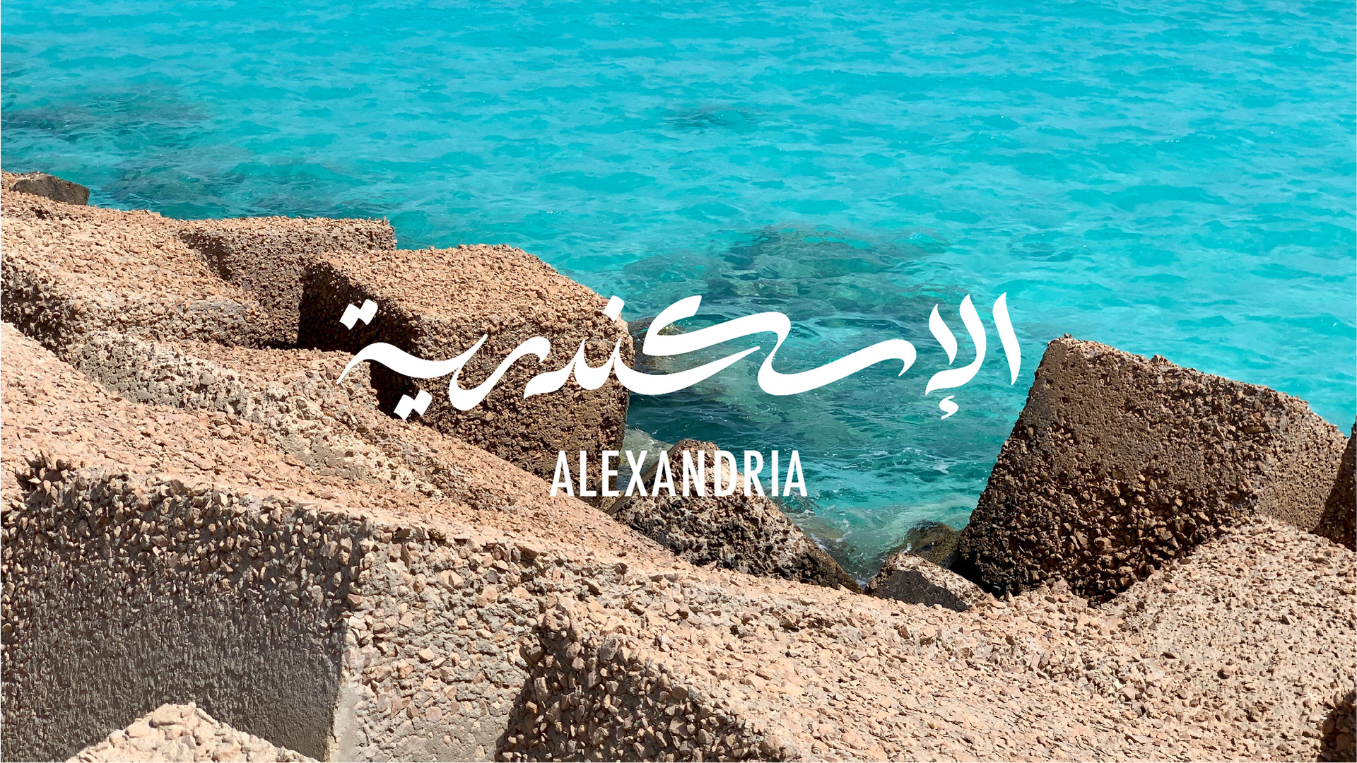
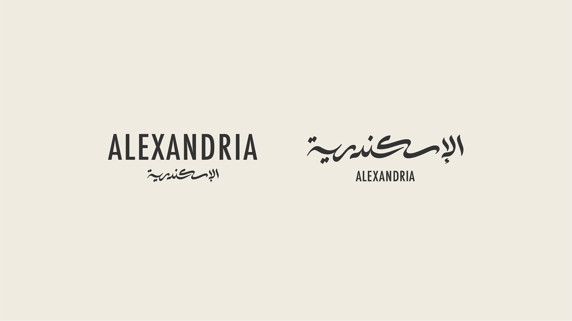
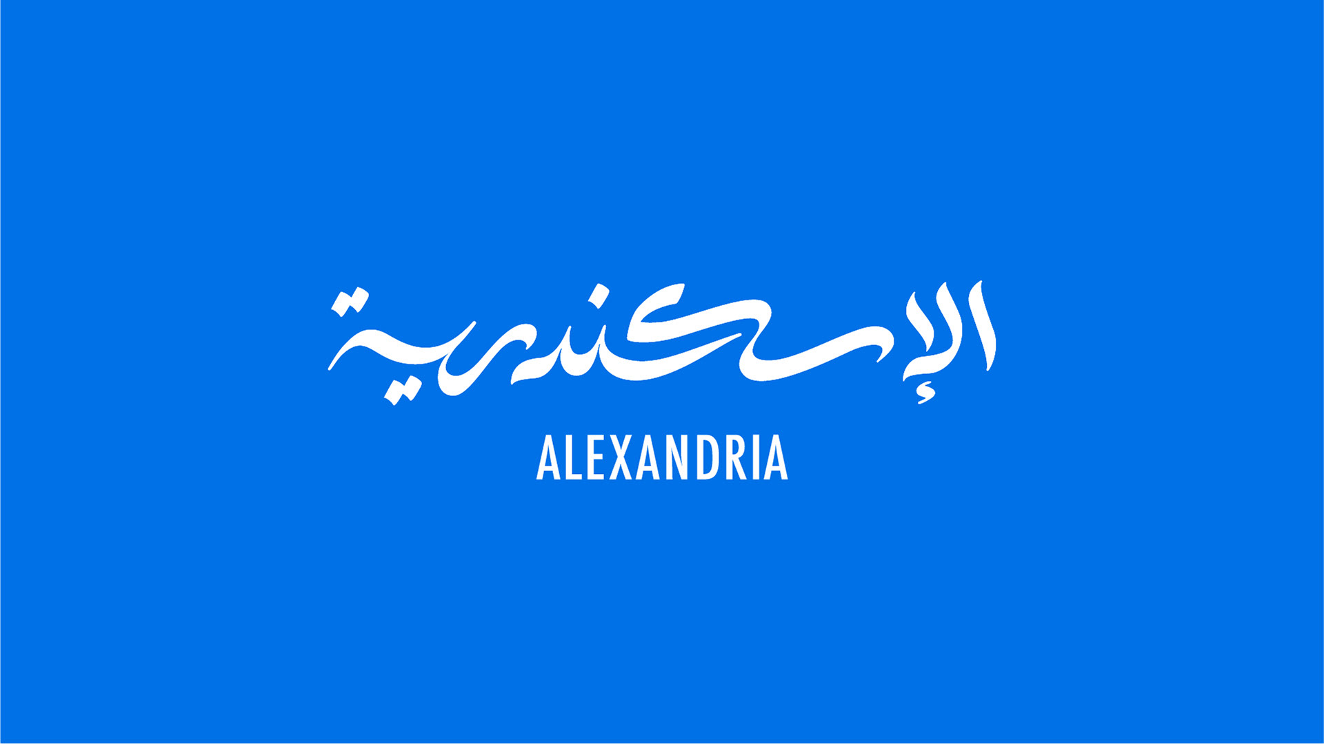
The challenge in the logo design was how to create a logo that gives the audience the same feeling that they have for the city and represents a very old and rich city with its beaches, monuments, culture, and history.
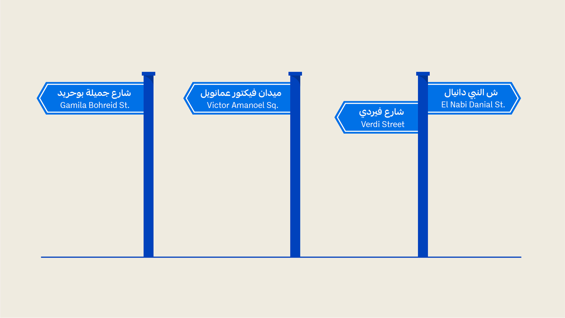
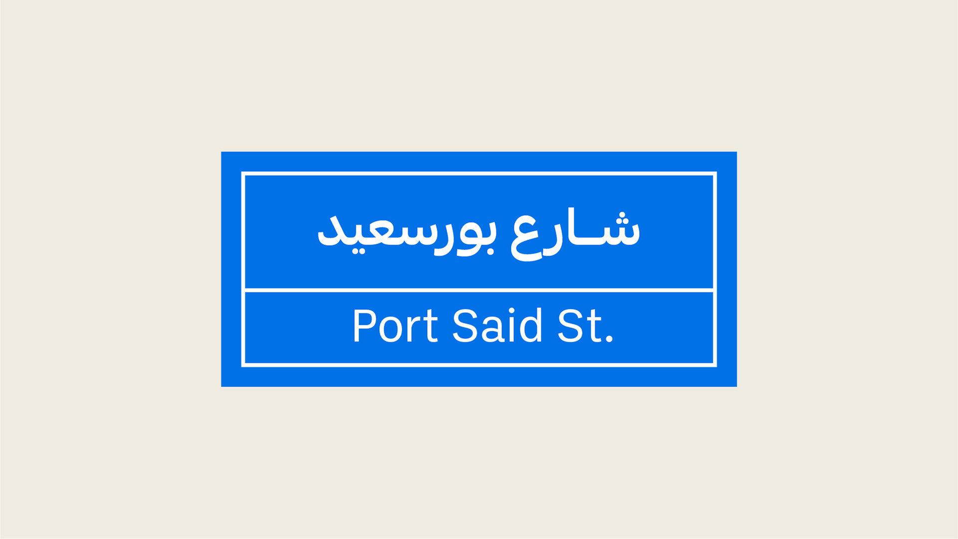
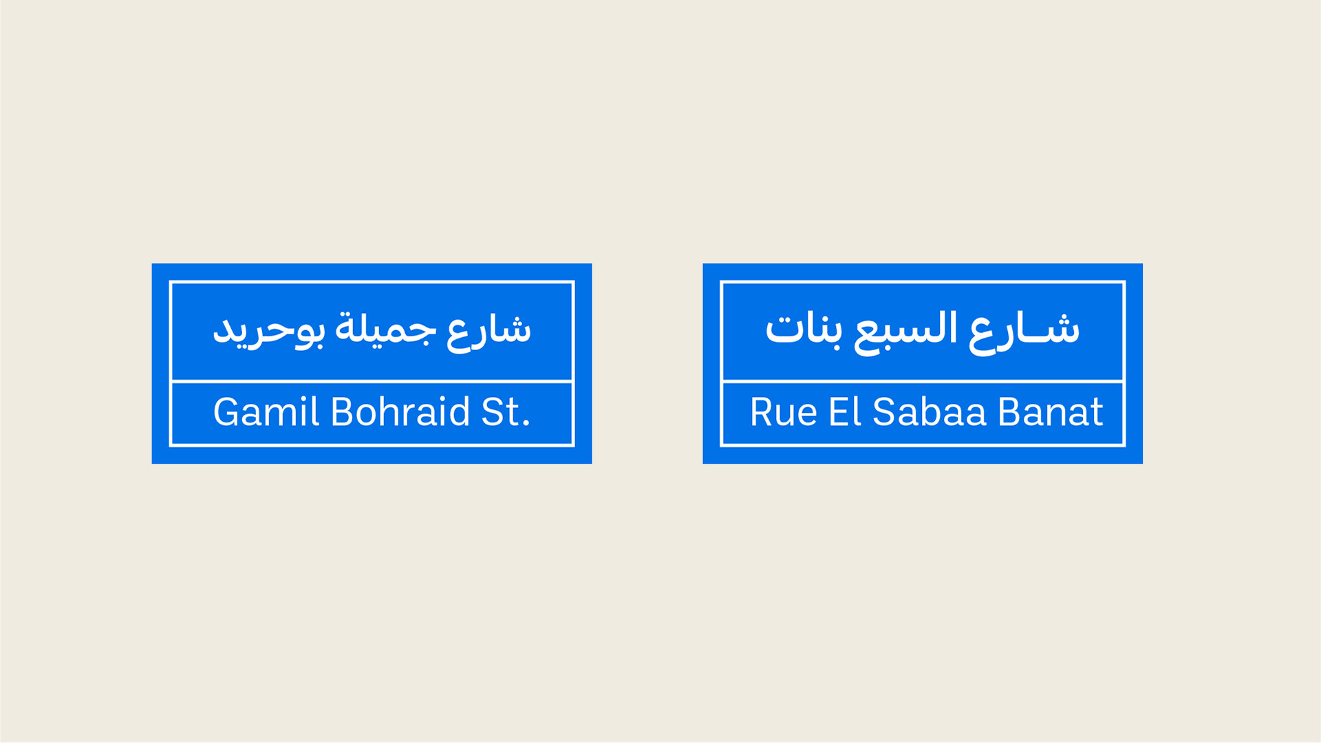
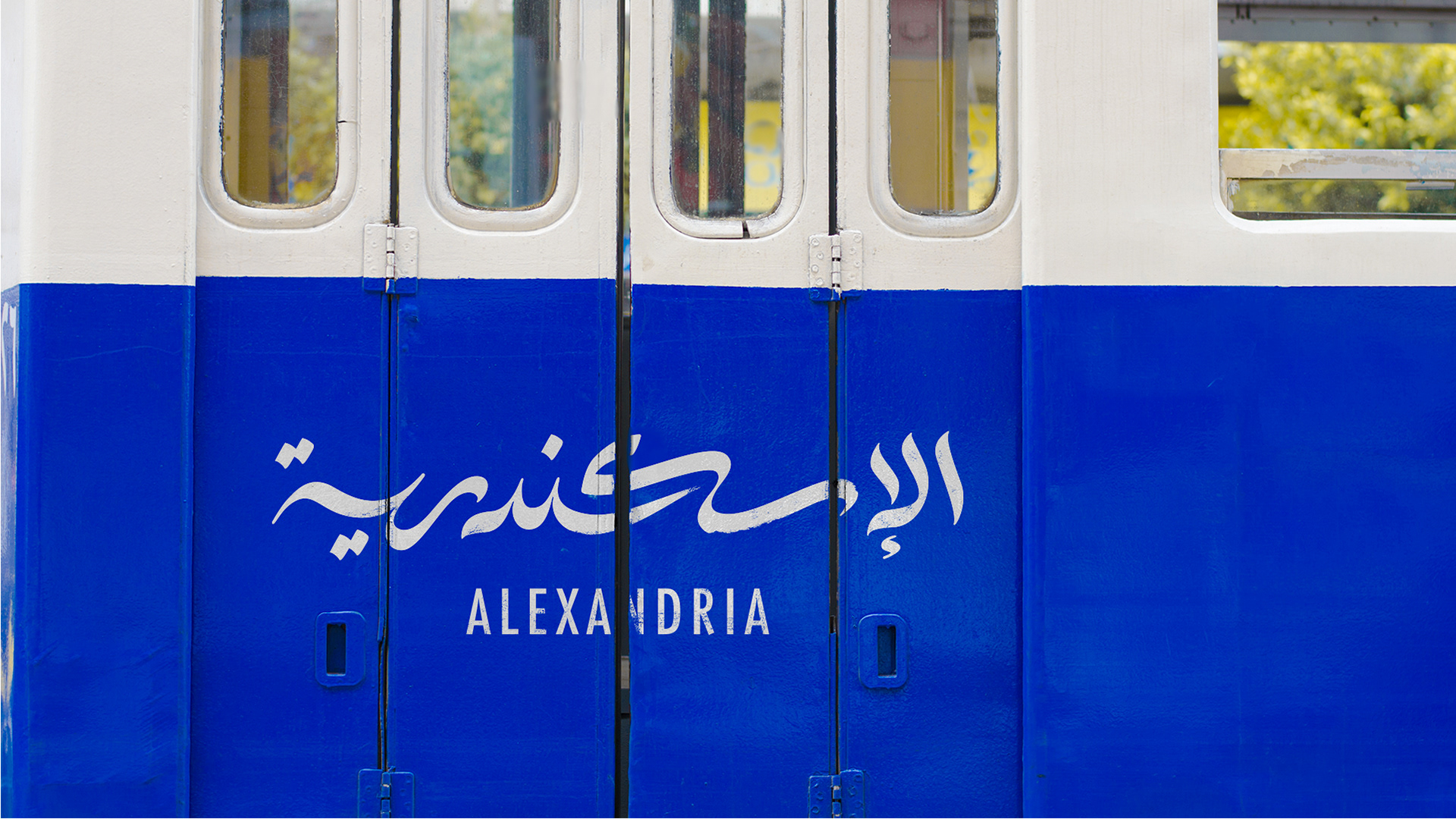
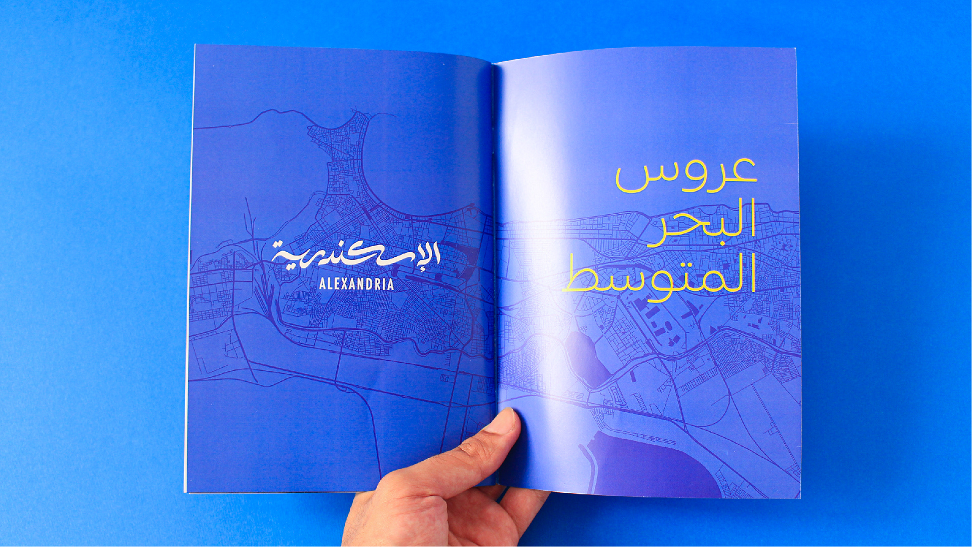
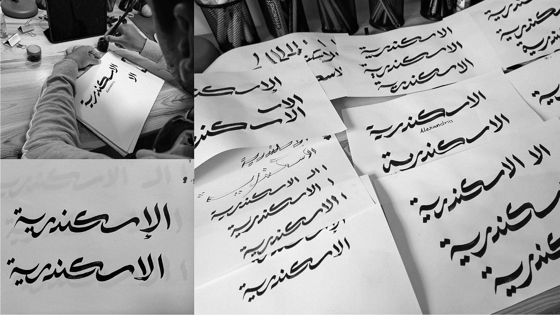
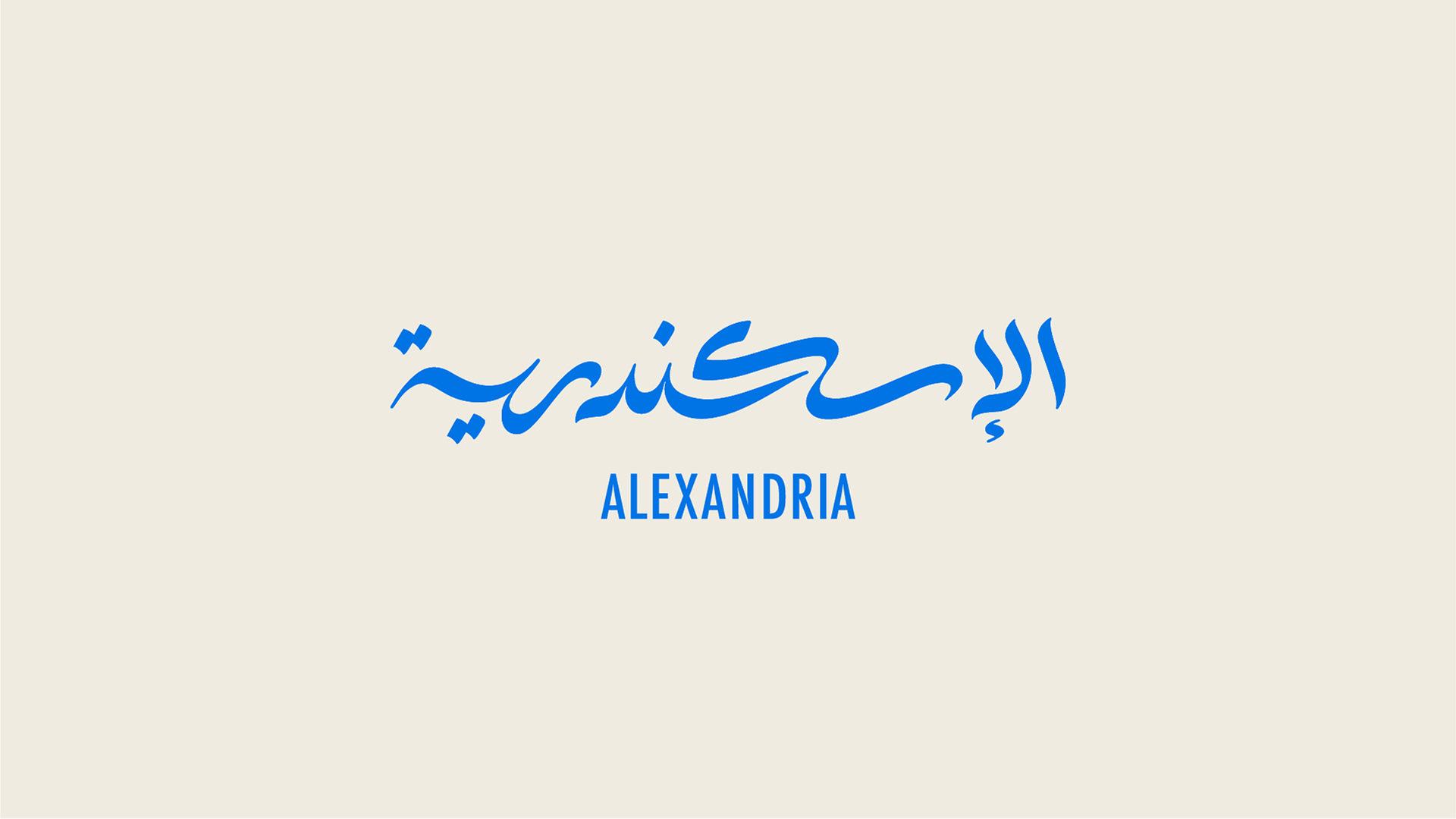
The solution had to be a logotype. The city name, written in a way that is inspired from the calligraphy on the fishing boats and old street signs. The new lettering has the feeling of fresh air in it and represents the movement of the sea and waves.
The logo was tested with a number of people and it gave most of them the same feeling of the sea and fresh air, some of them felt history too.
The logo was tested with a number of people and it gave most of them the same feeling of the sea and fresh air, some of them felt history too.
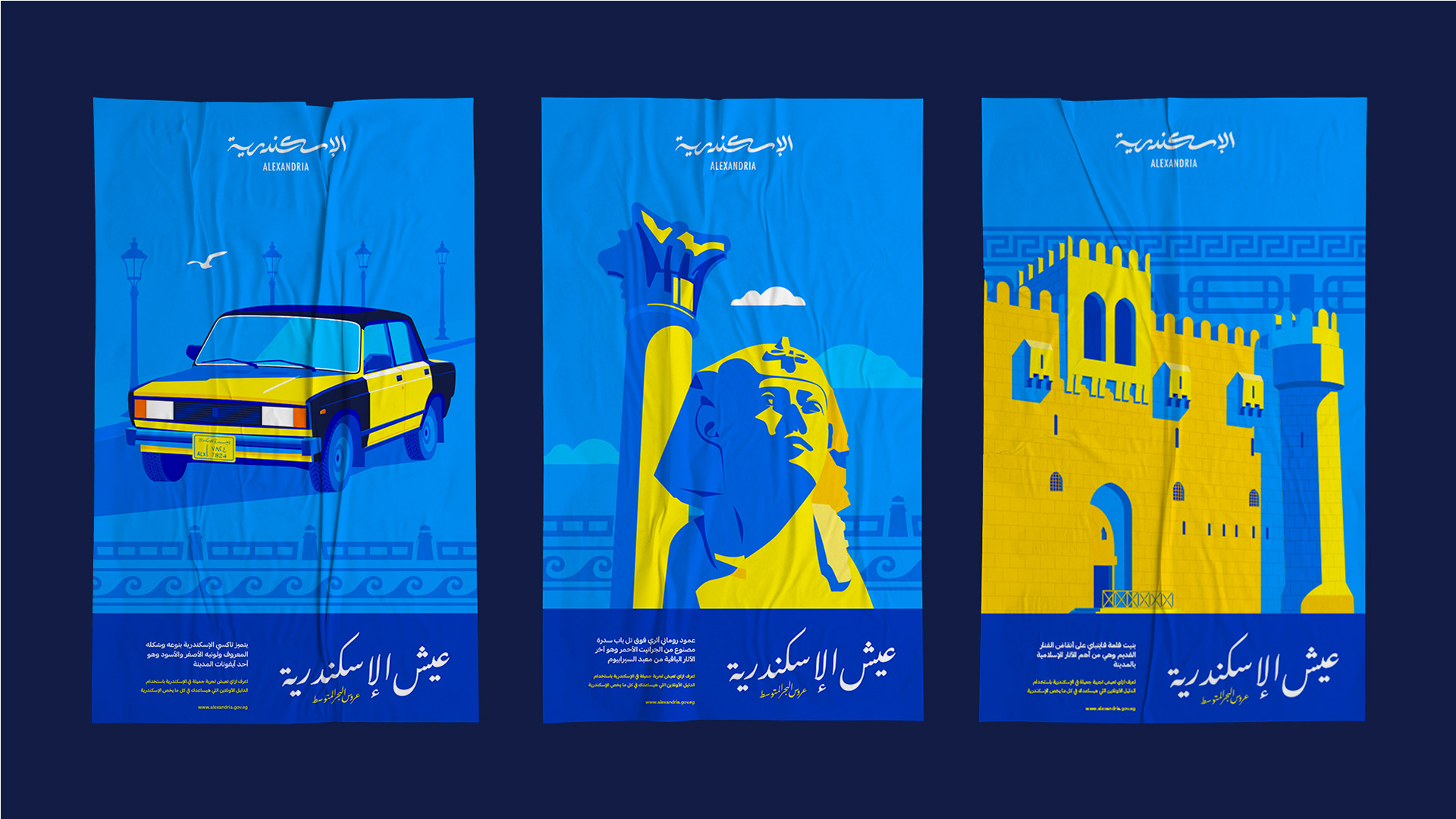
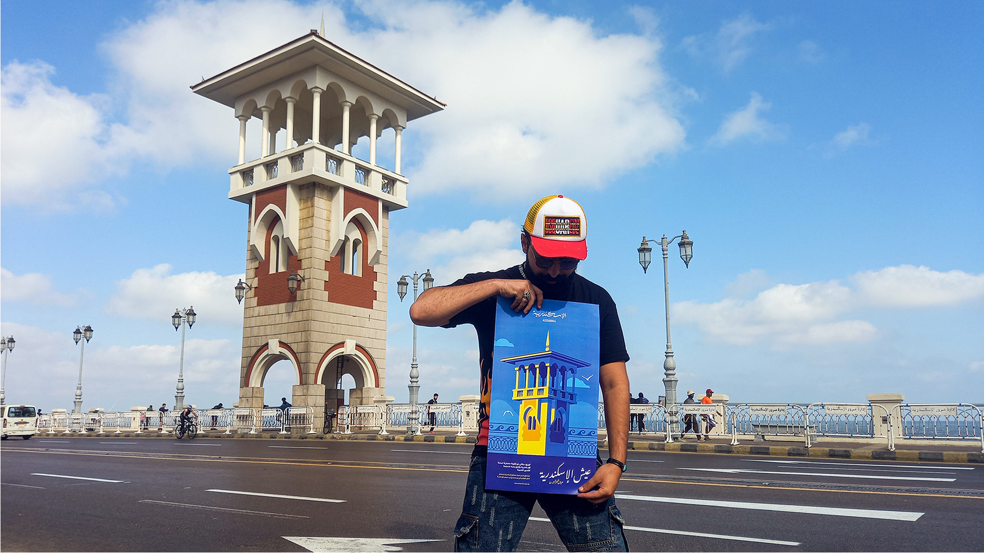
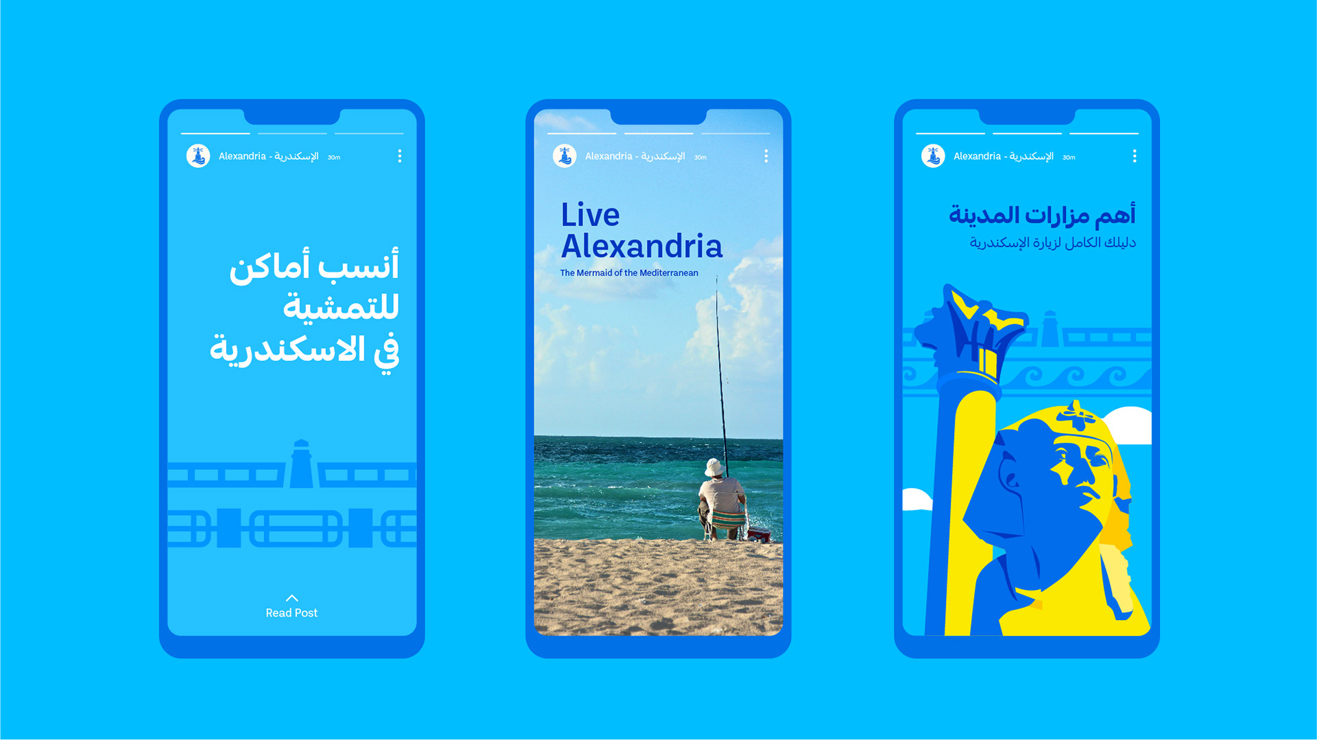
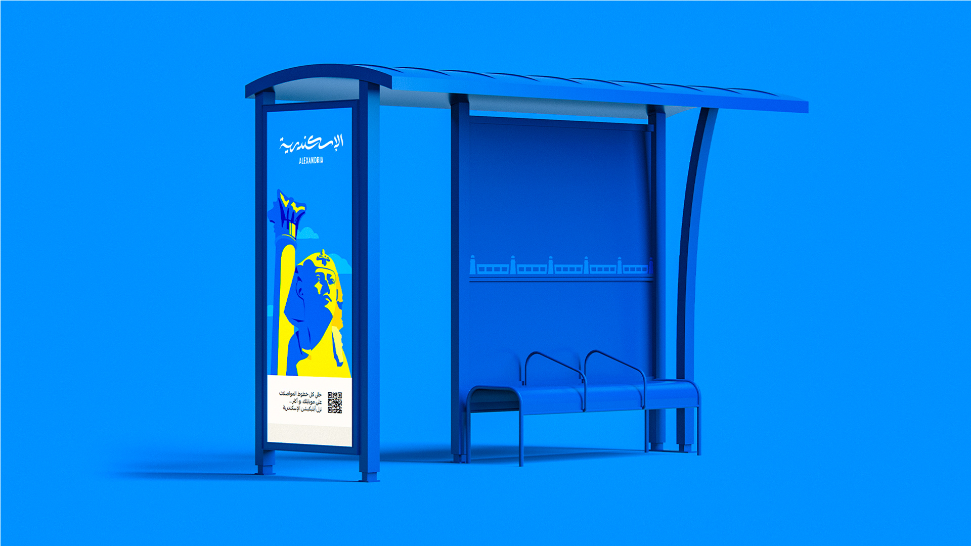
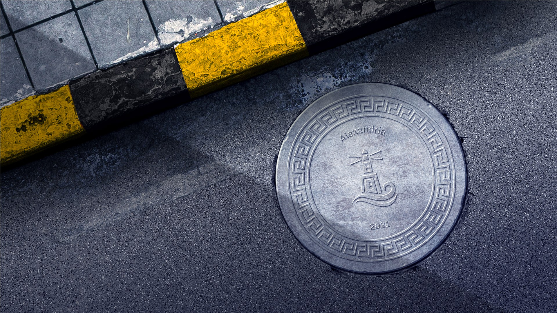
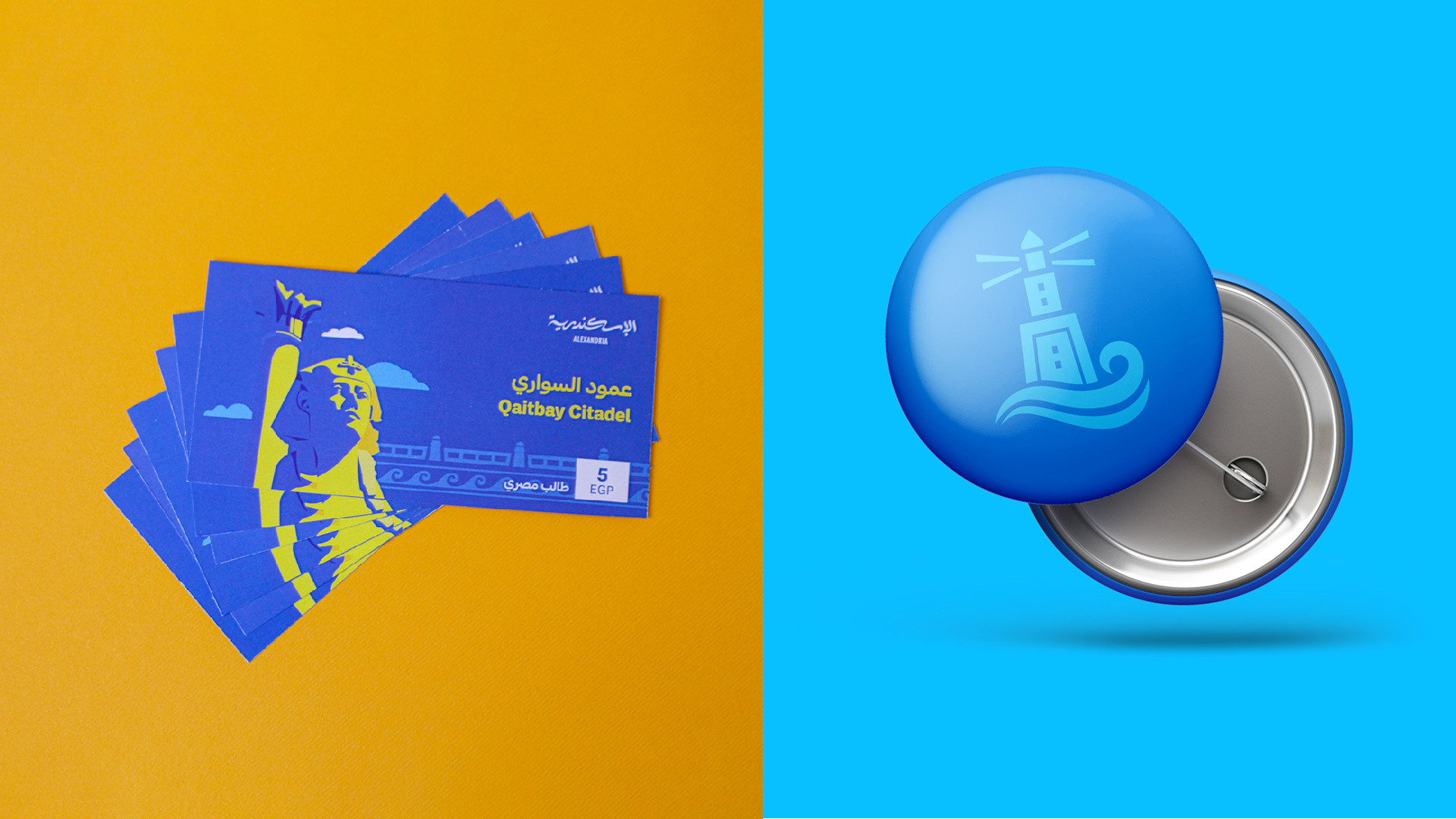
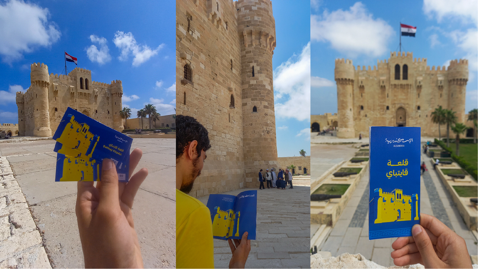
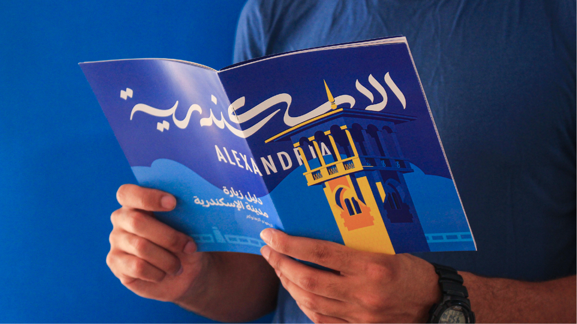
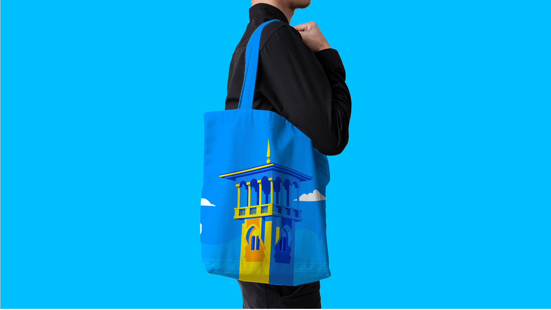
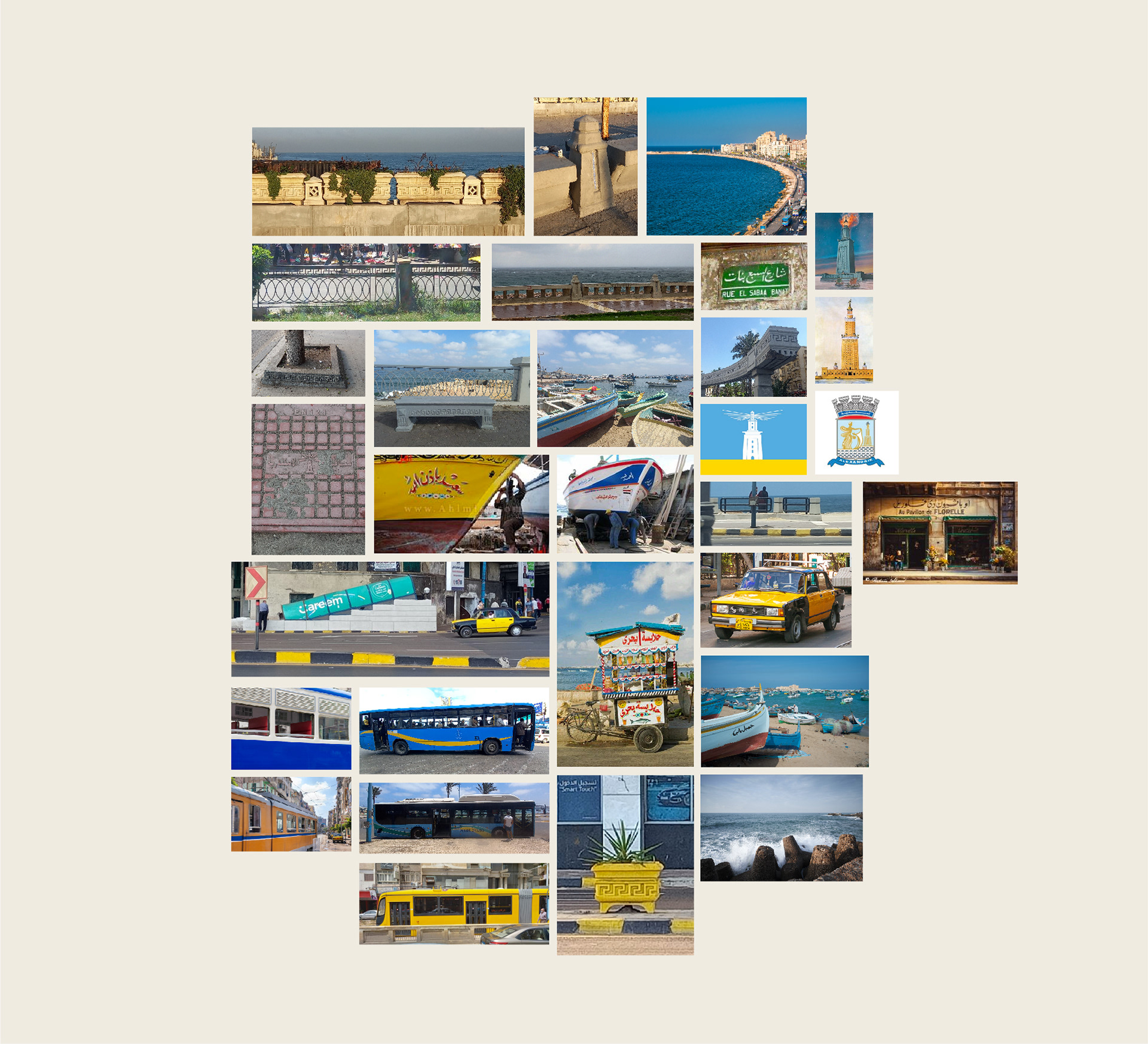
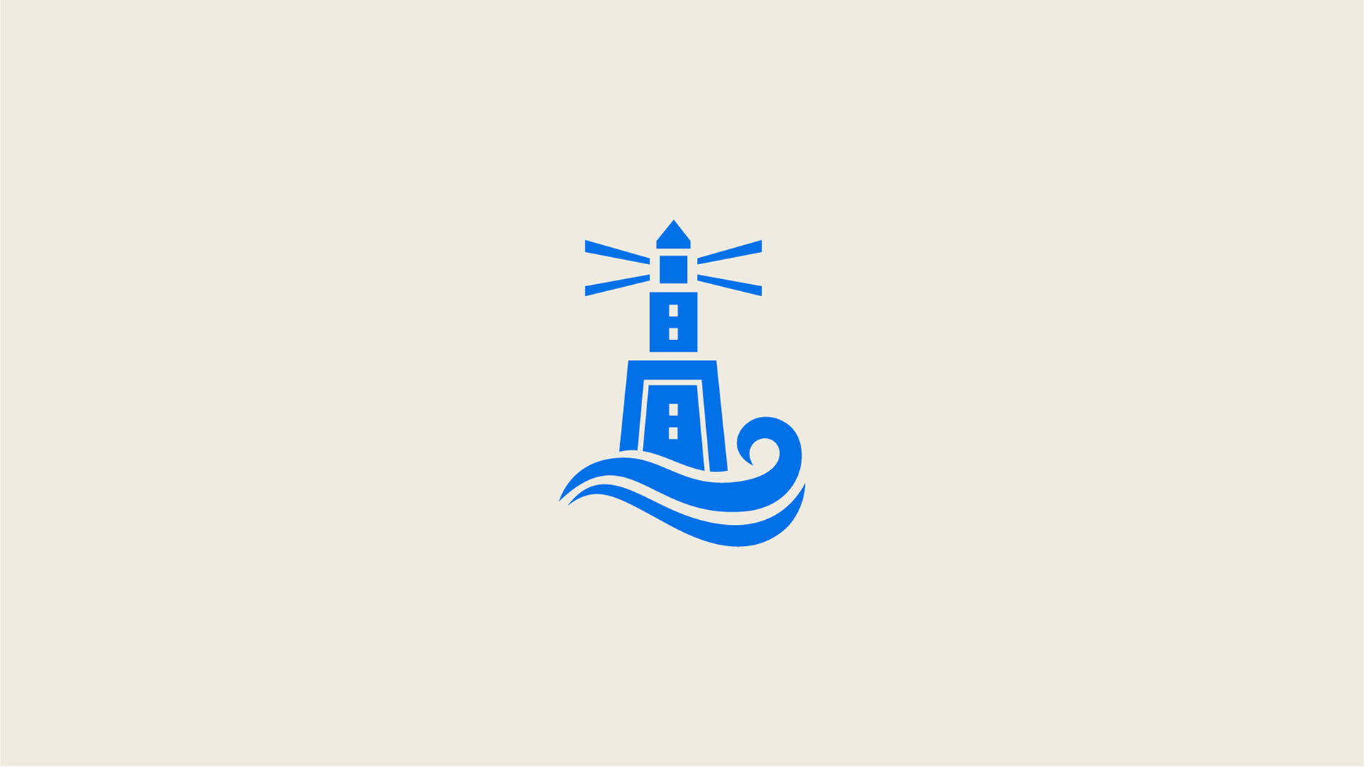
Alexandria is well known for its great lighthouse, although it was damaged by three earthquakes between 956 AD and 1323. But it is still used as a symbol for the city. The lighthouse icon is used on the city logo, flag, and many other sub-brands. But it was always drawn in a different version and there was no unified symbol for it. So we worked on that and created a brand new symbol that should alternate the logo in some uses where we need a small icon instead of a wide logotype.
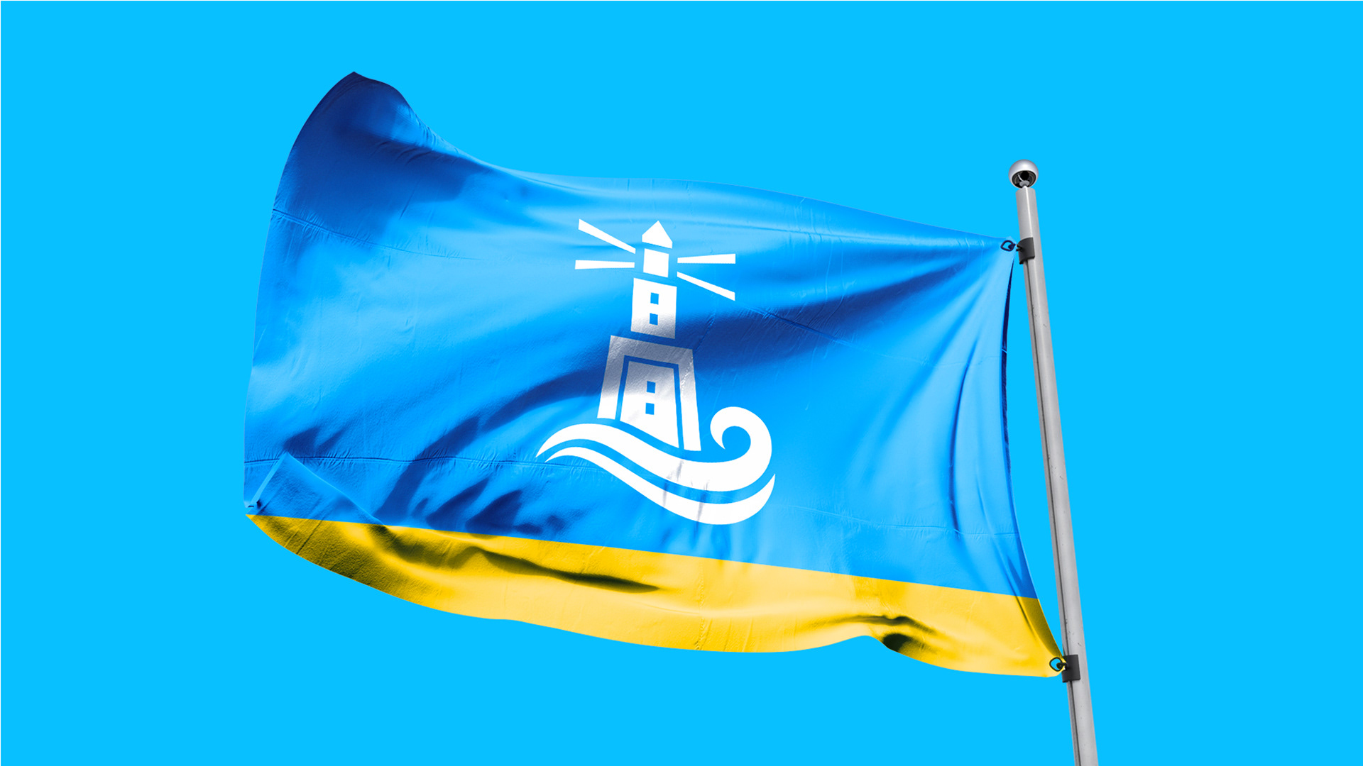
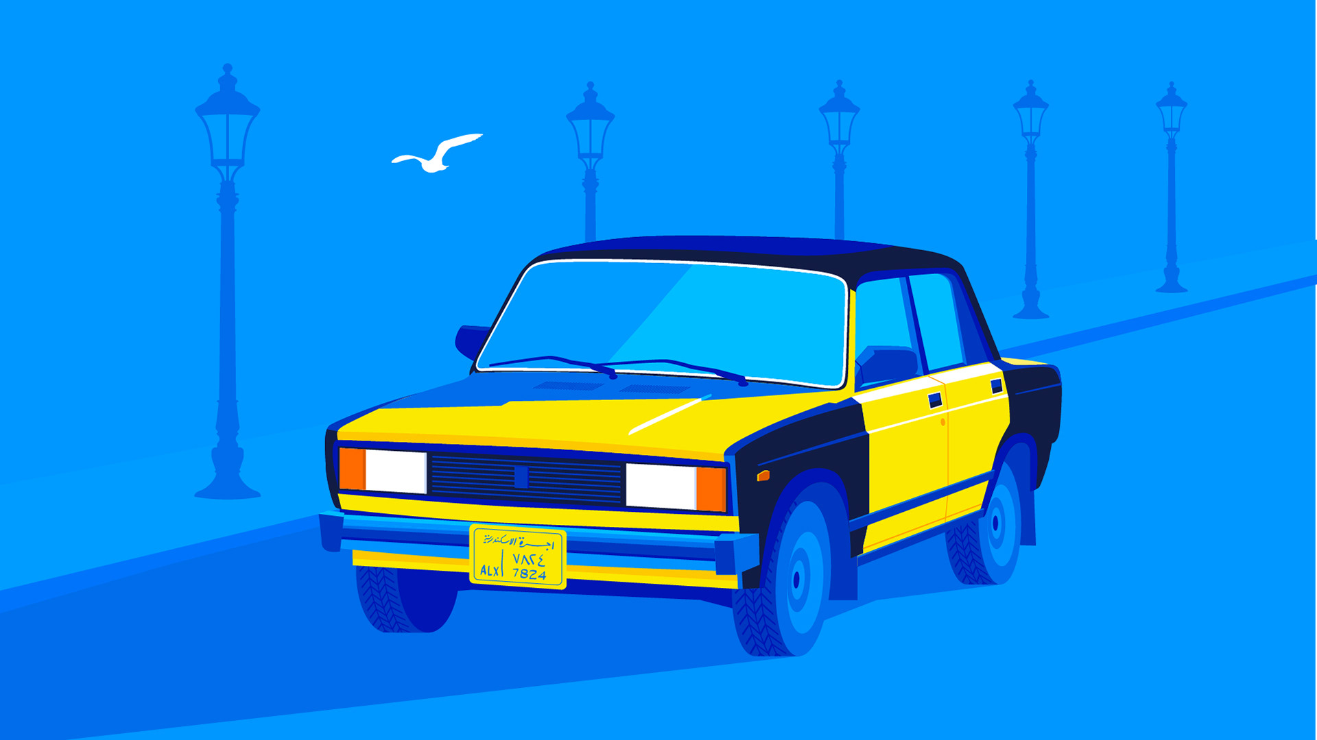
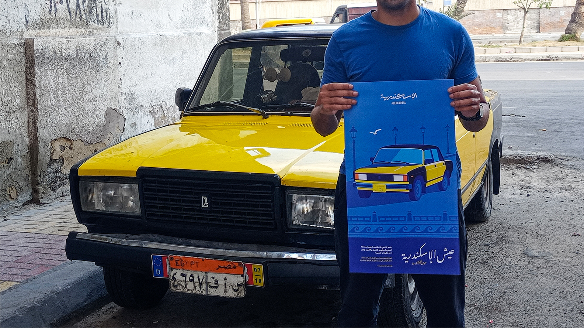
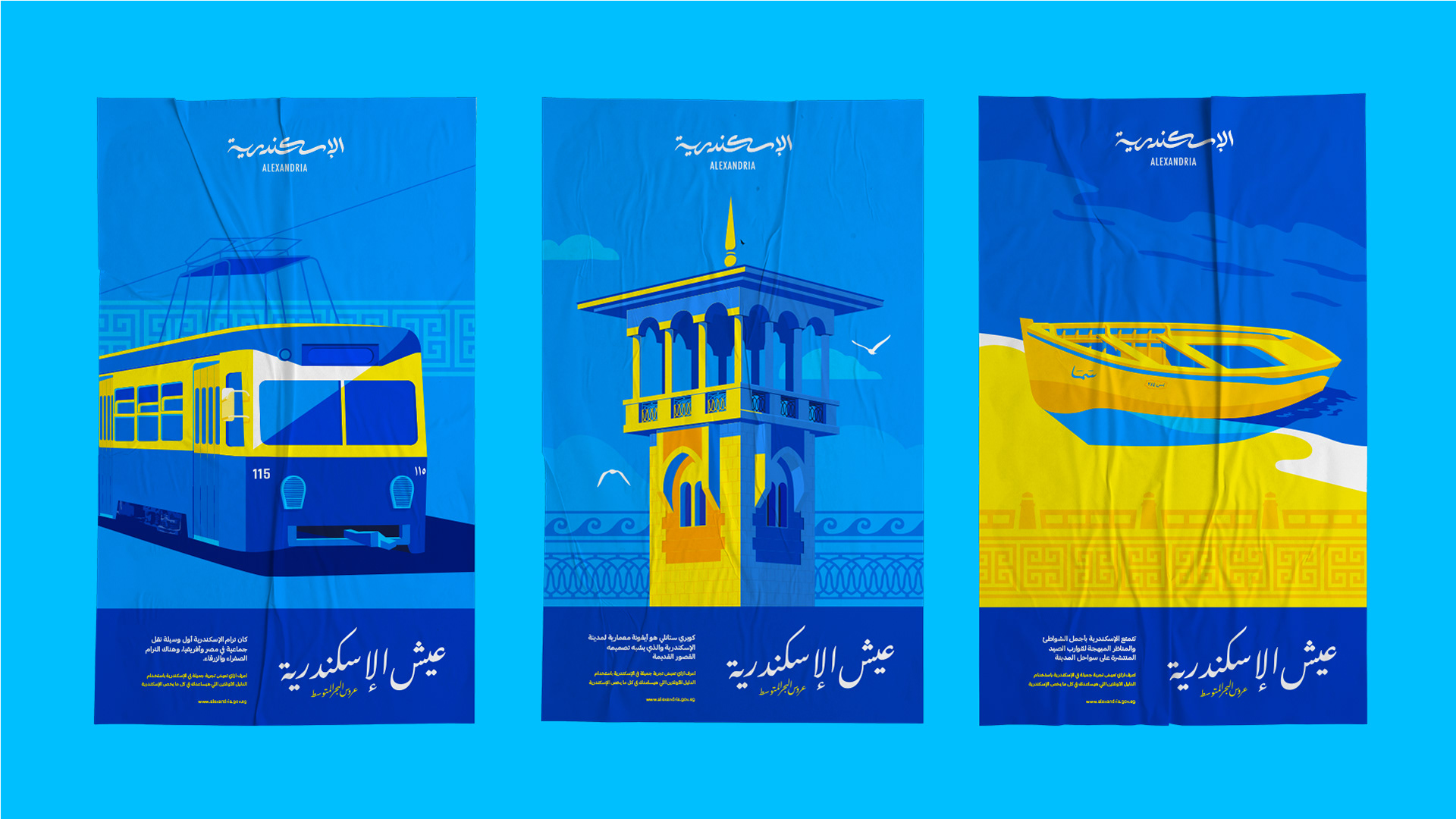
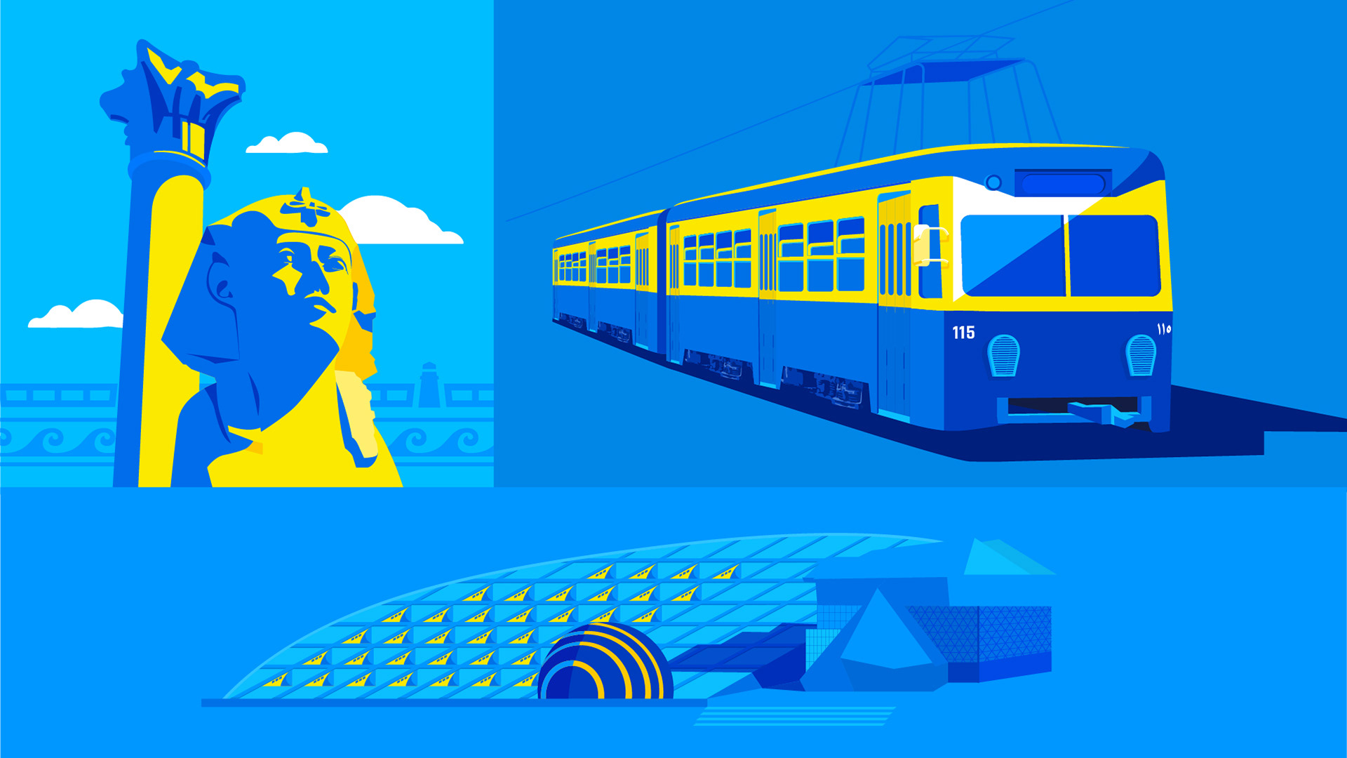
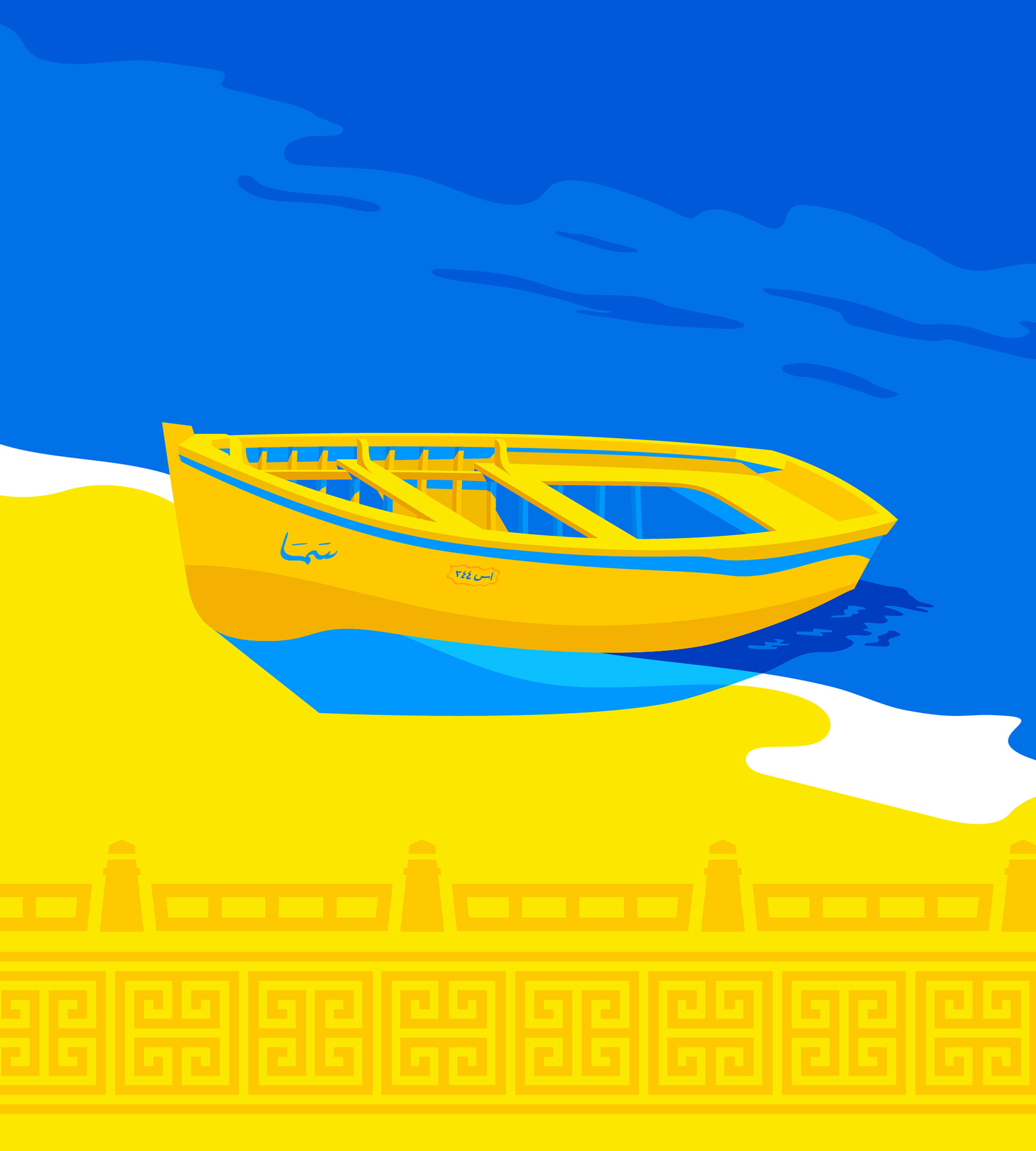
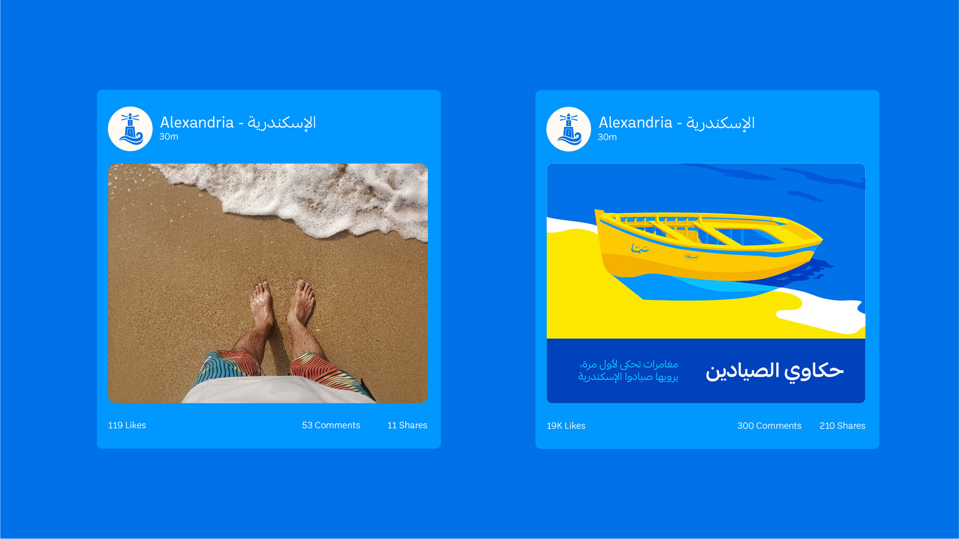
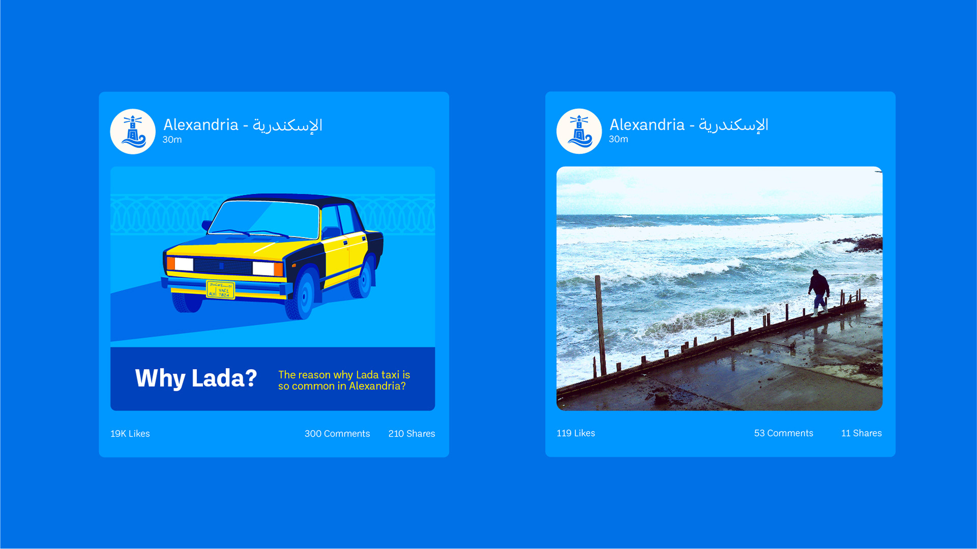
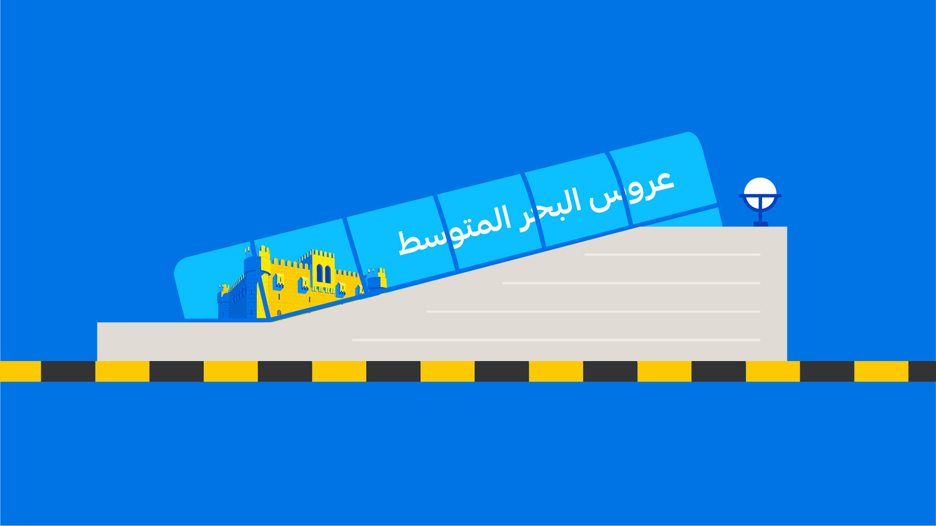
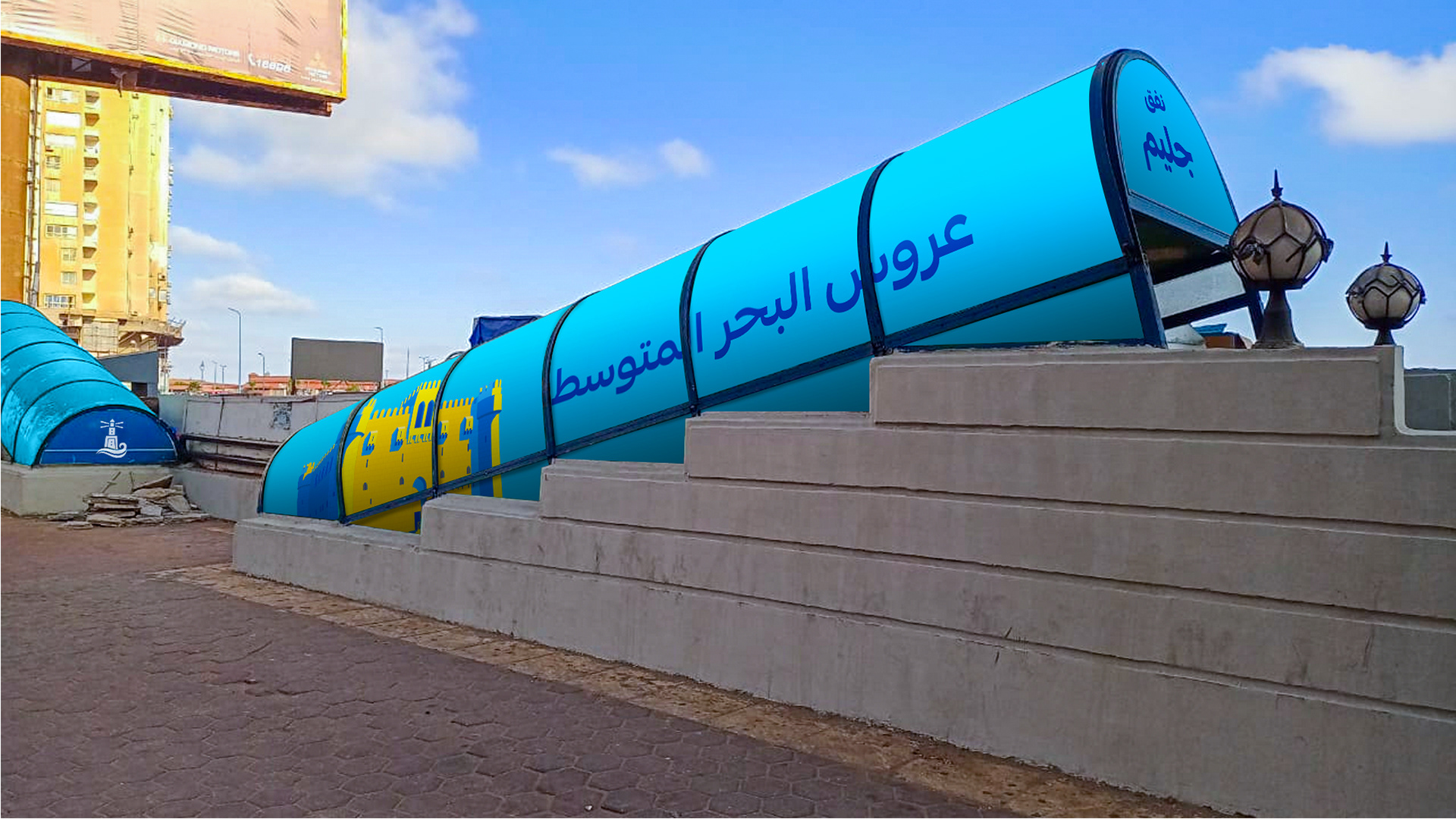
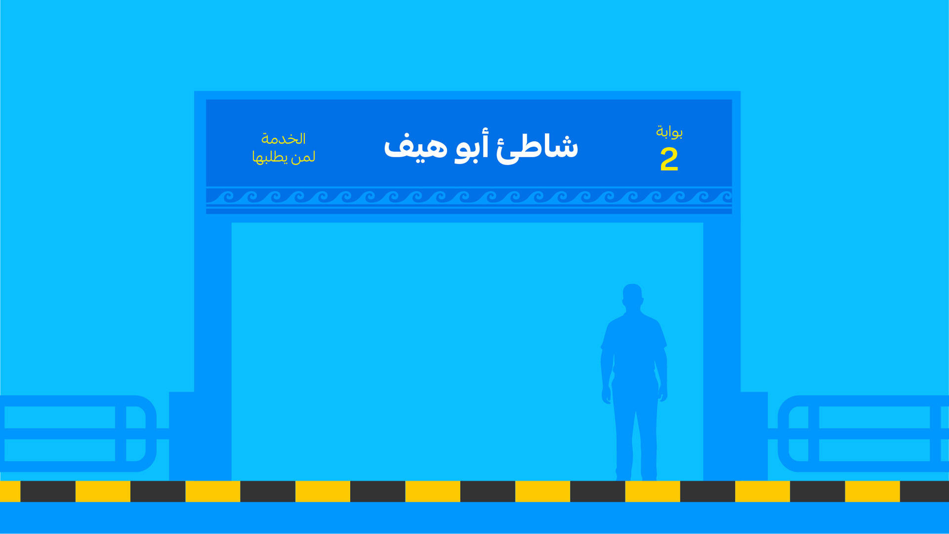
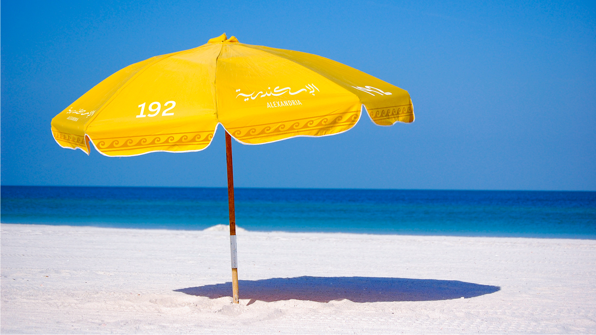
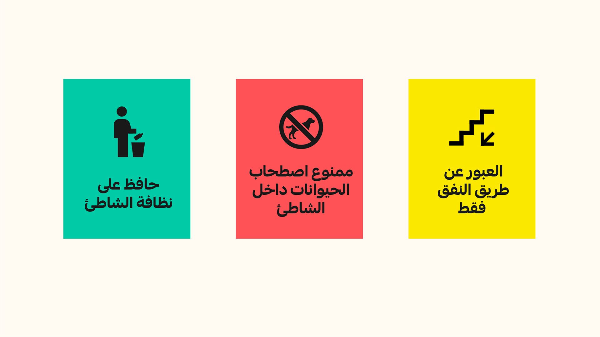
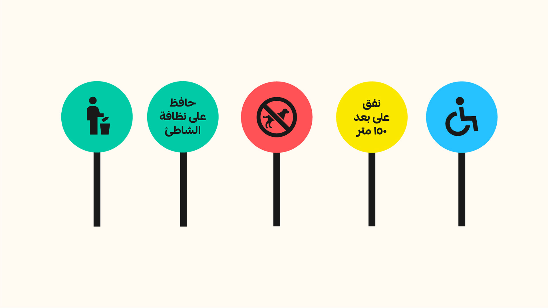
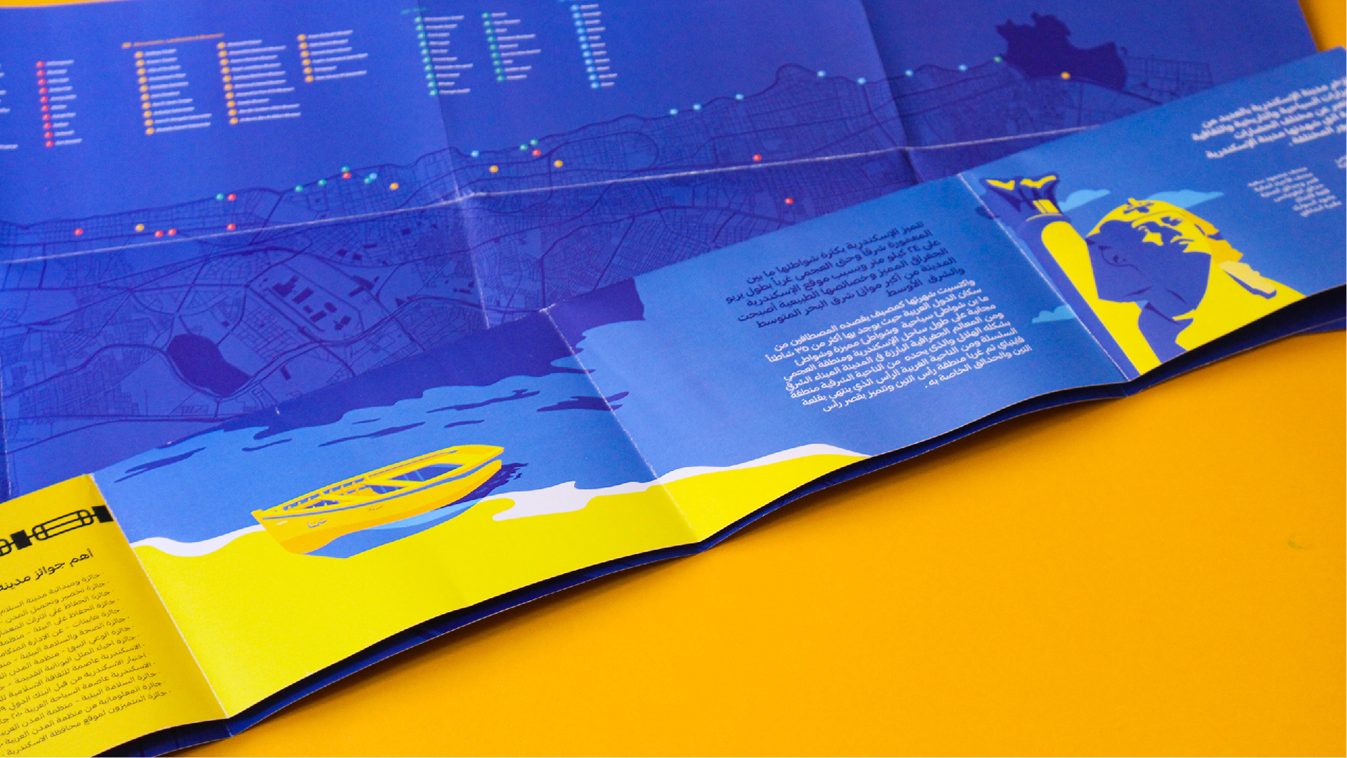
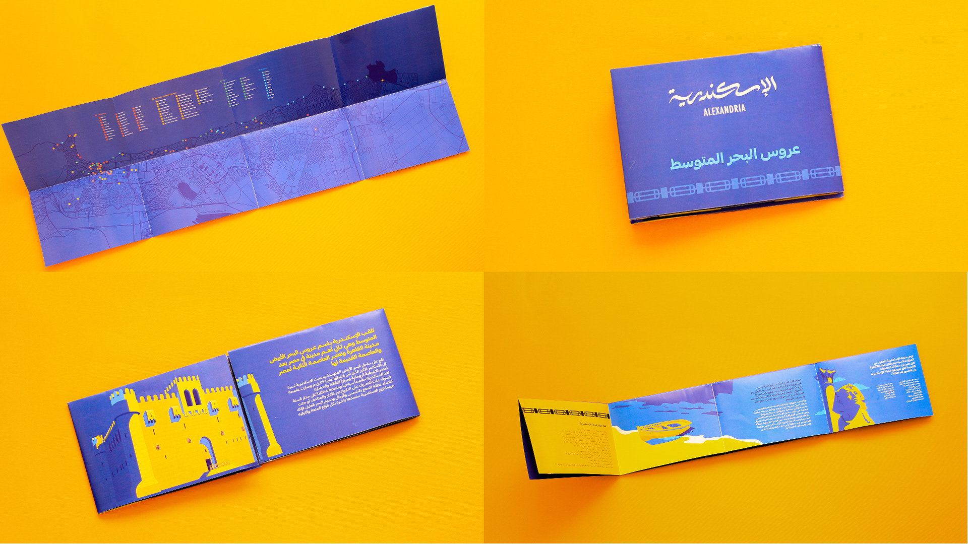
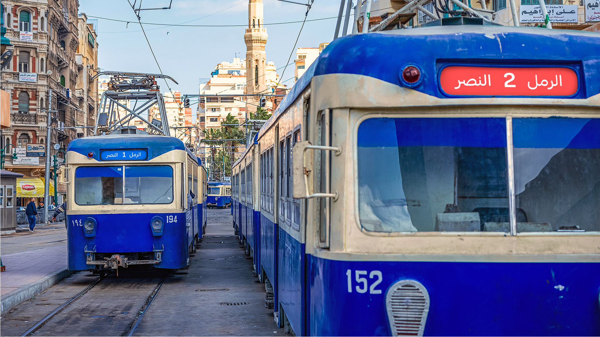
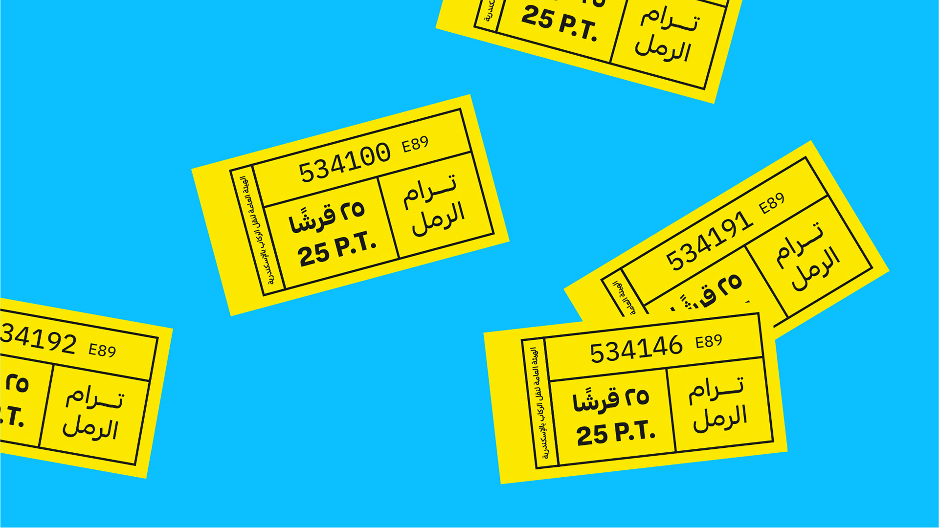
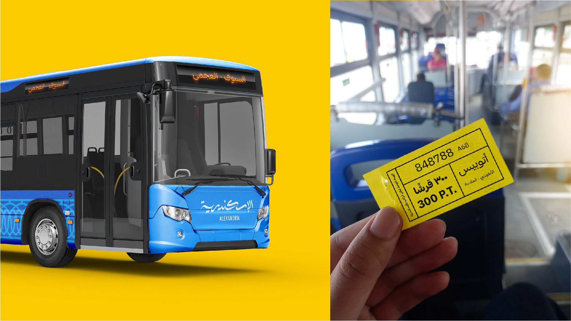
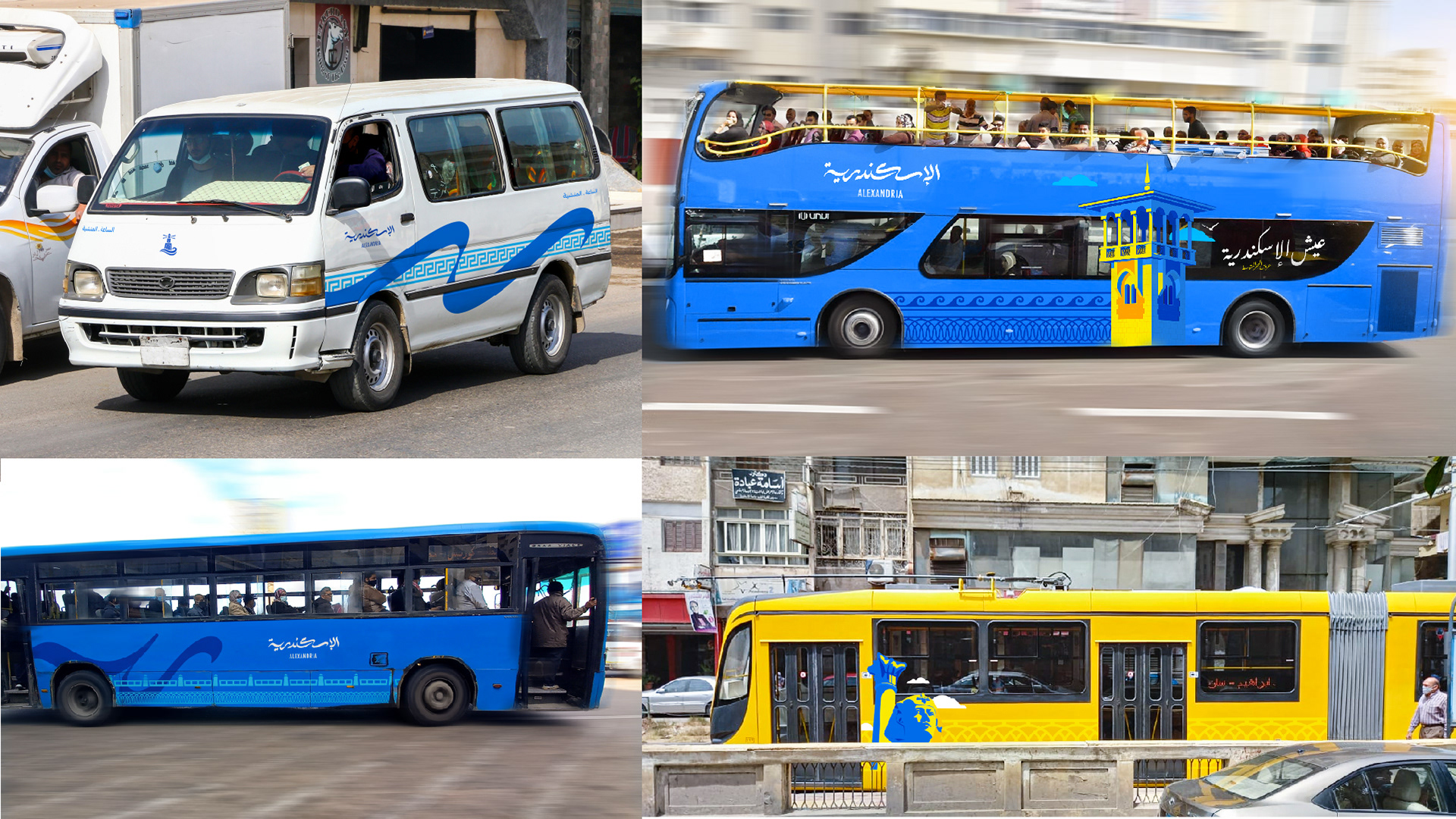
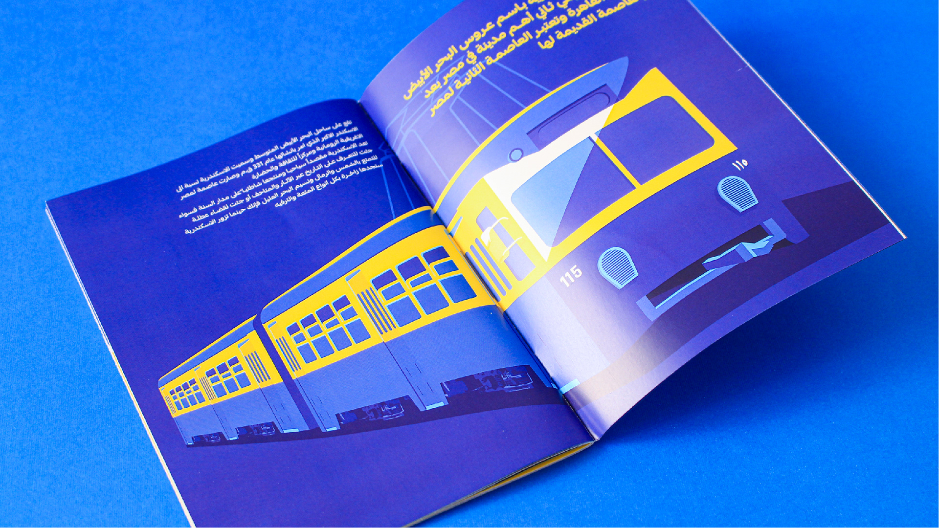
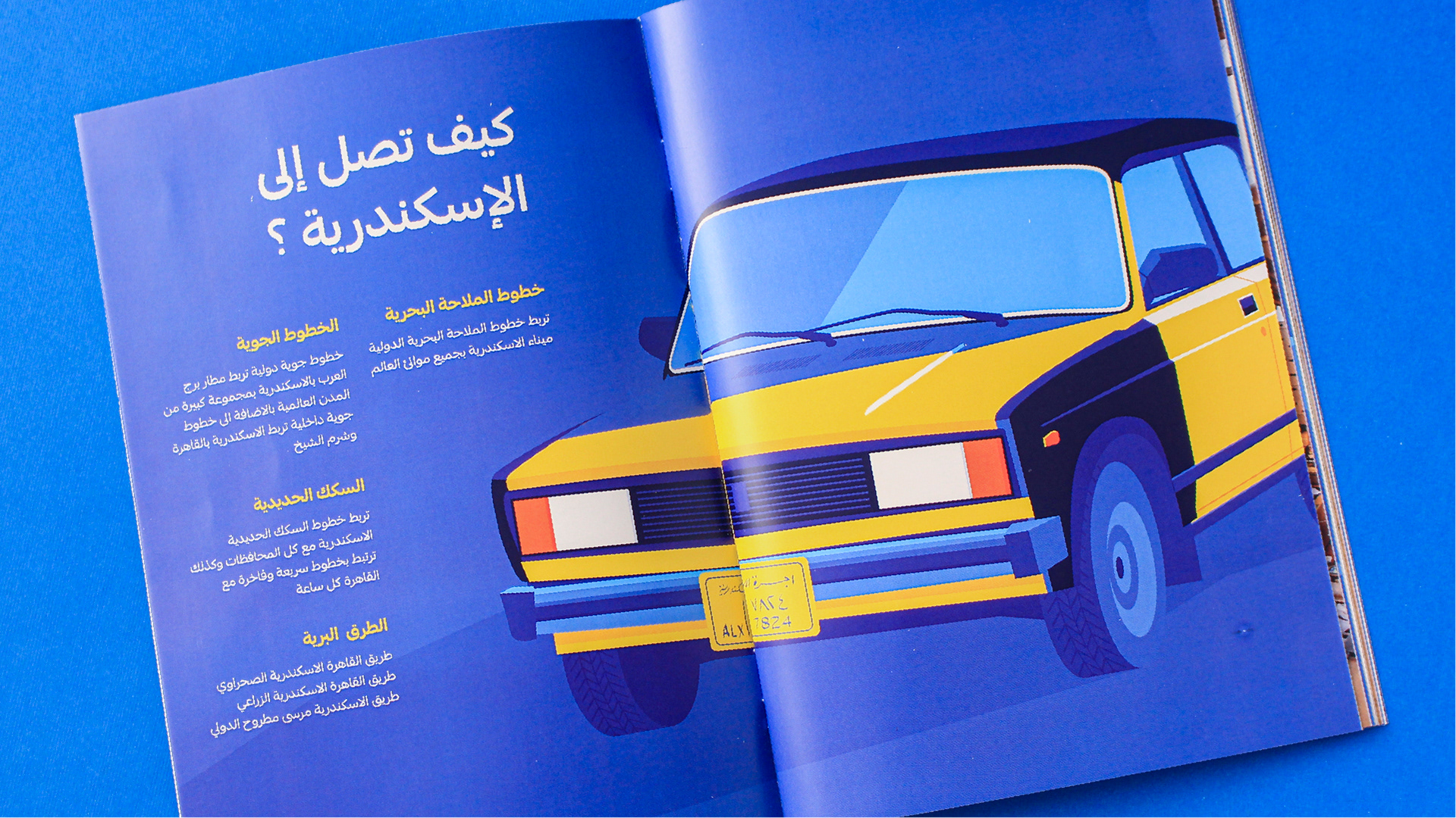
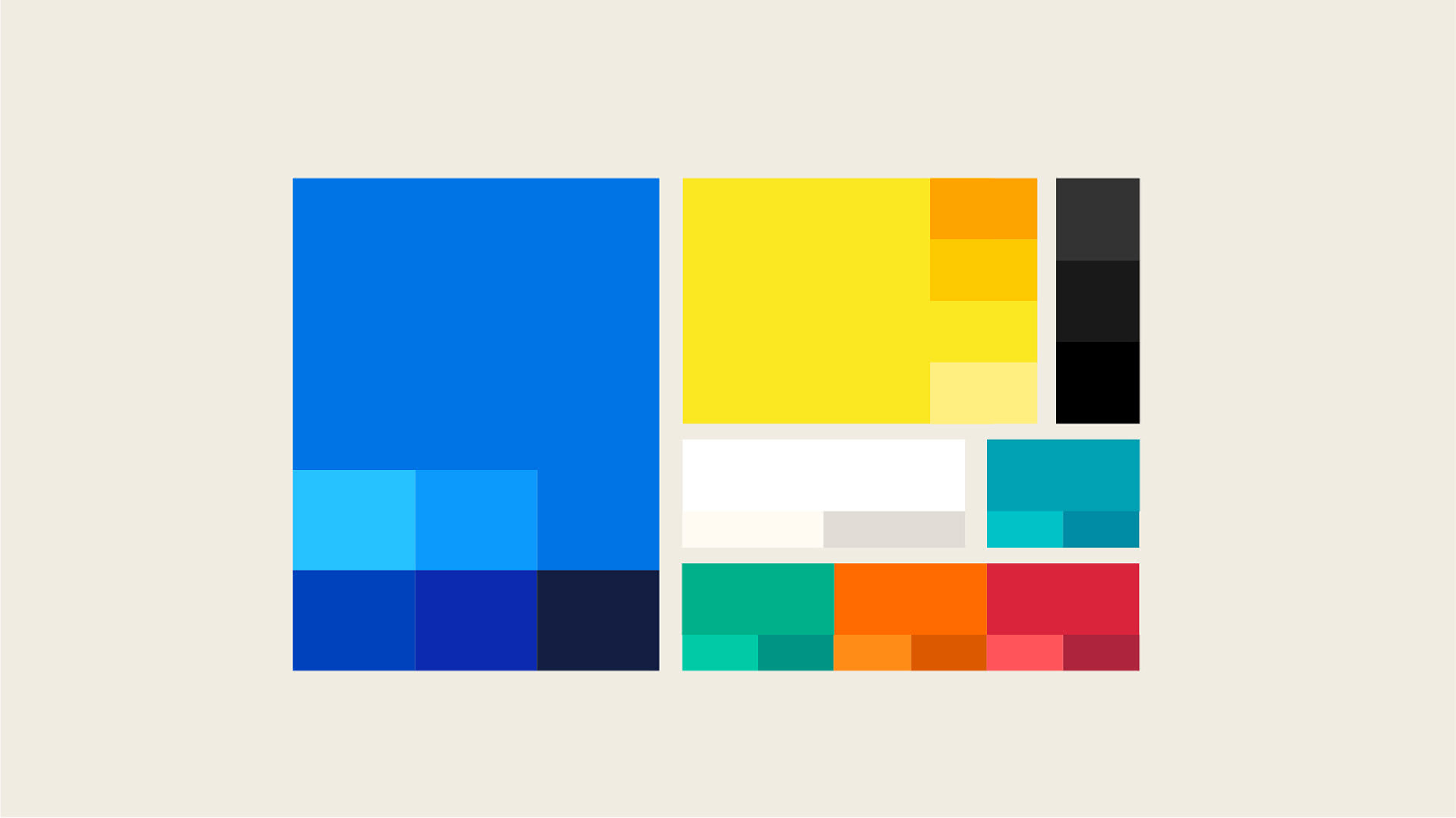
The color palette was so easy to create because you will notice it the first moment you arrive at Alexandria, The blue color of the sea, sky, tram, buses. And the yellow is on the famous black and yellow taxi, on the tram and sidewalks. These colors are also used on other different places and painted on many walls, even the flag of Alexandria has two colors cyan and yellow.
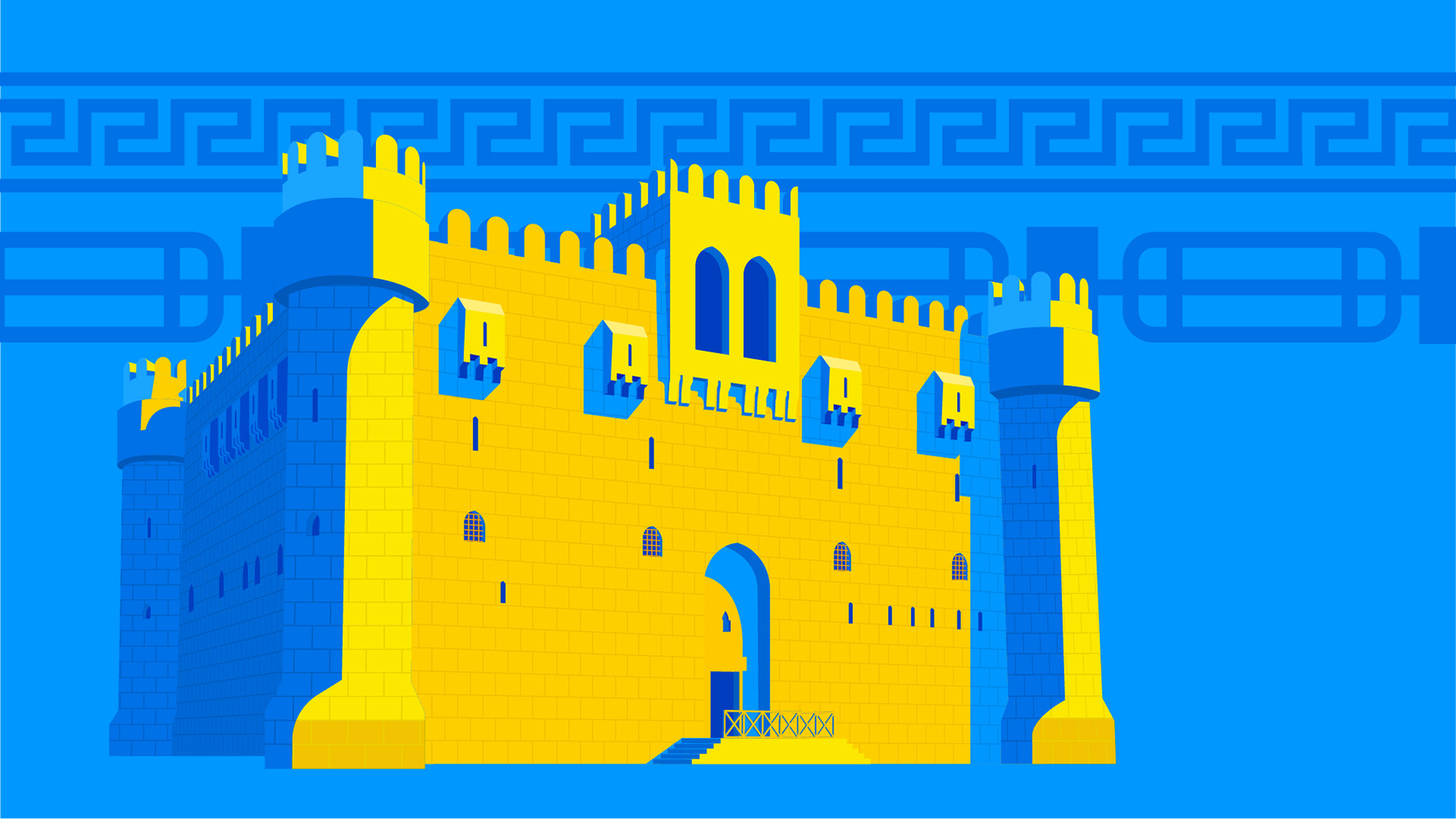
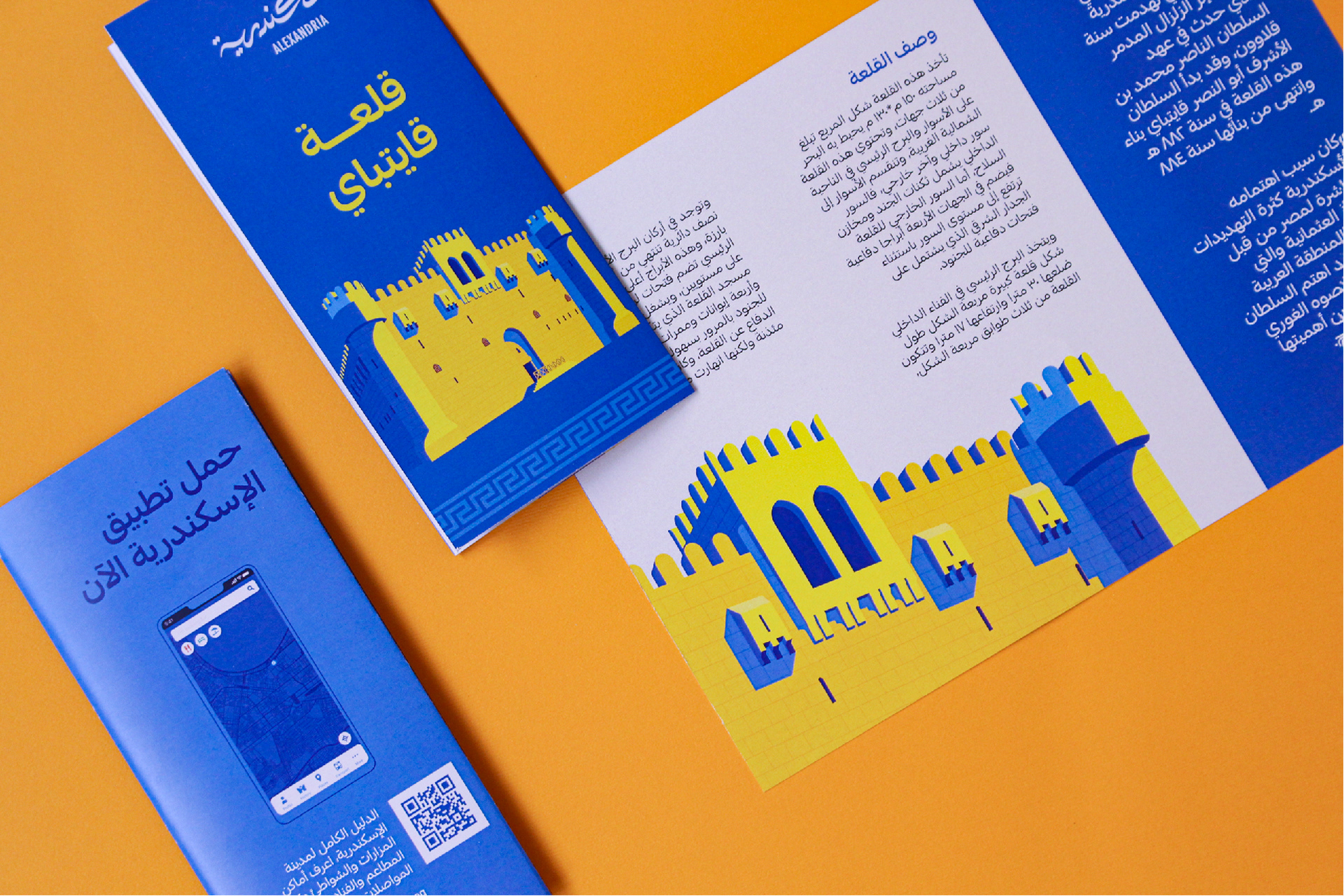
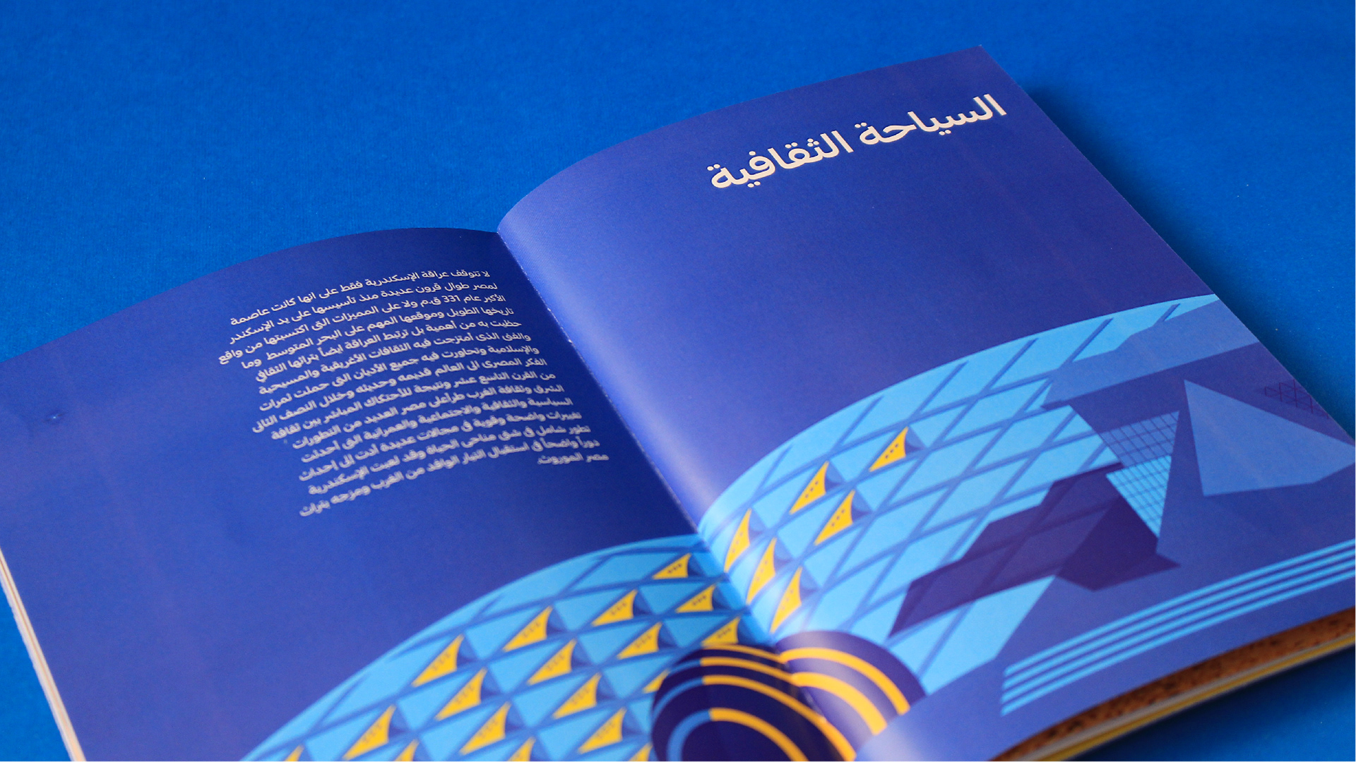
If you walk in Alexandria you will notice some patterns in many places, some of them are Greek, and the patterns of the railings in front of the sea, patterns are big part of the the theme.
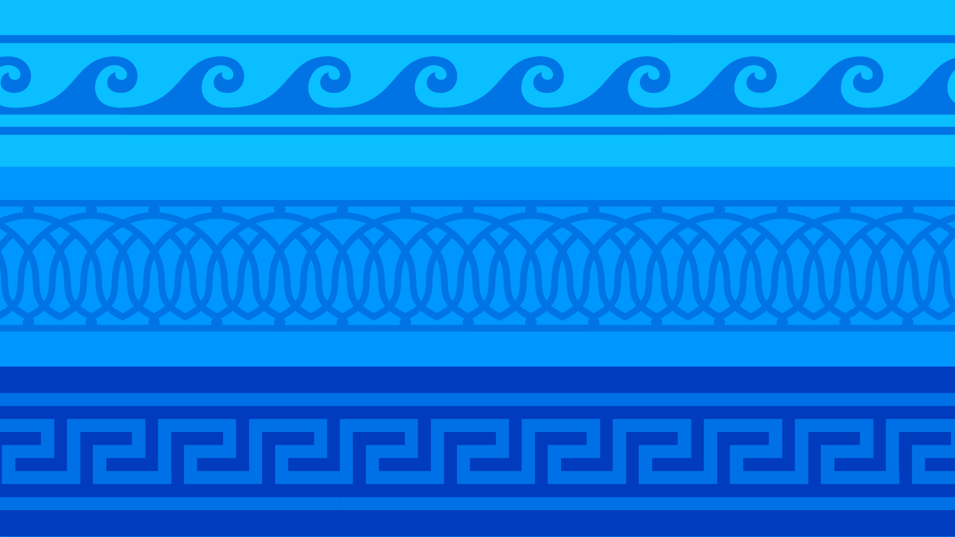
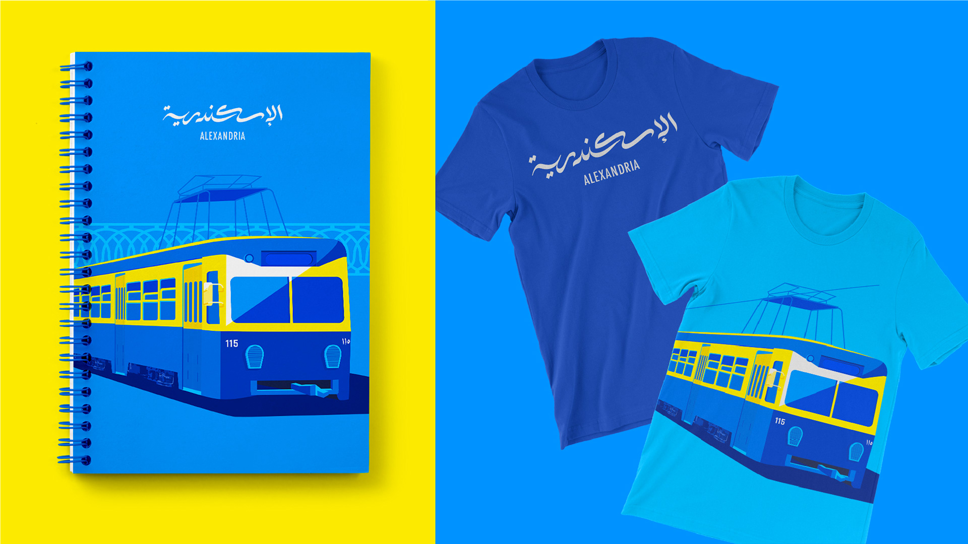
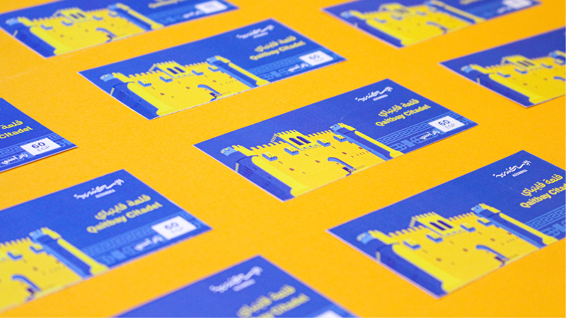
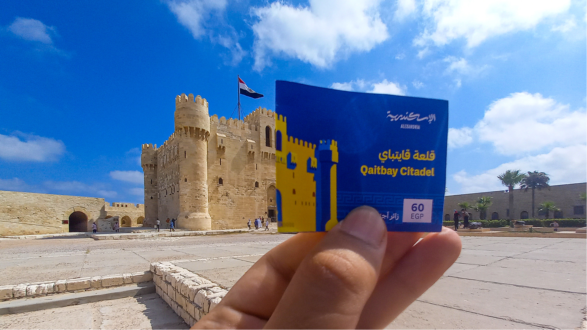
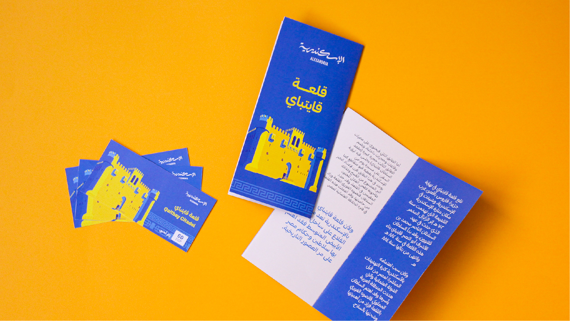
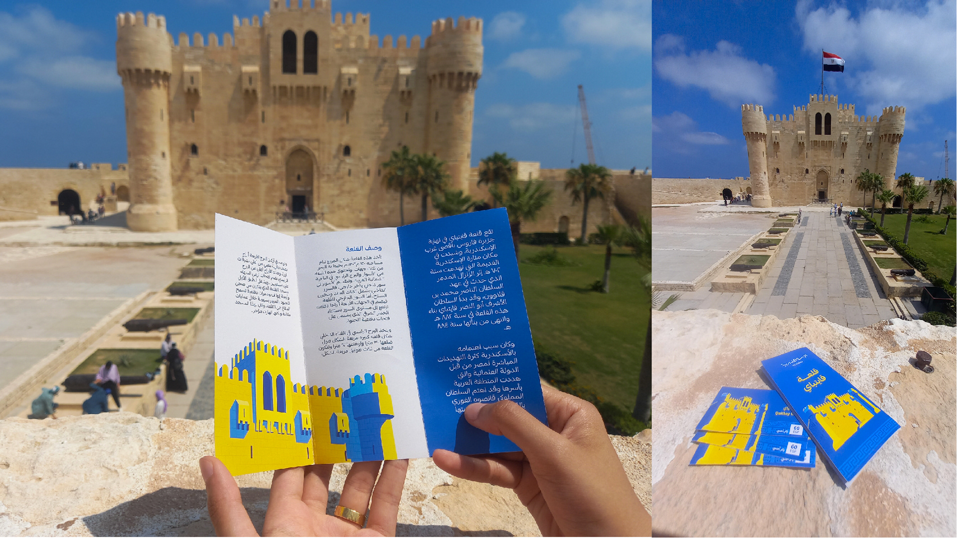
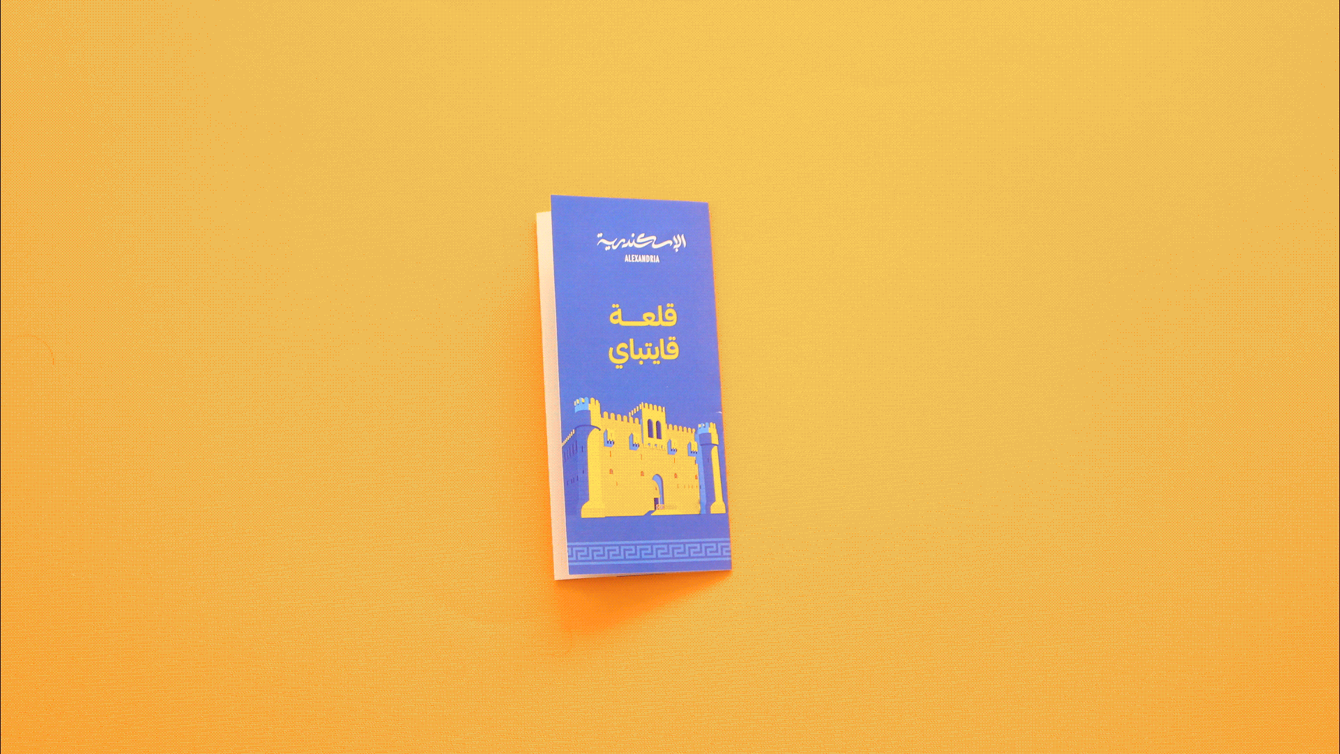
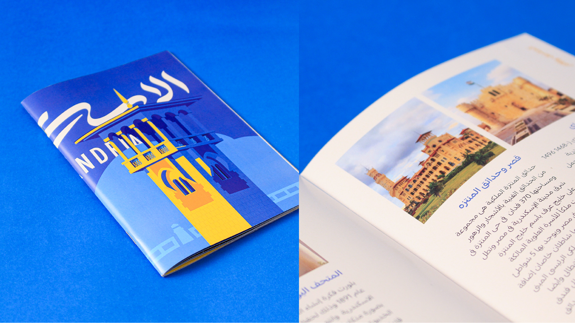
The identity theme is built on famous Alexandrian icons illustrated using the color palette and paired with our patterns.
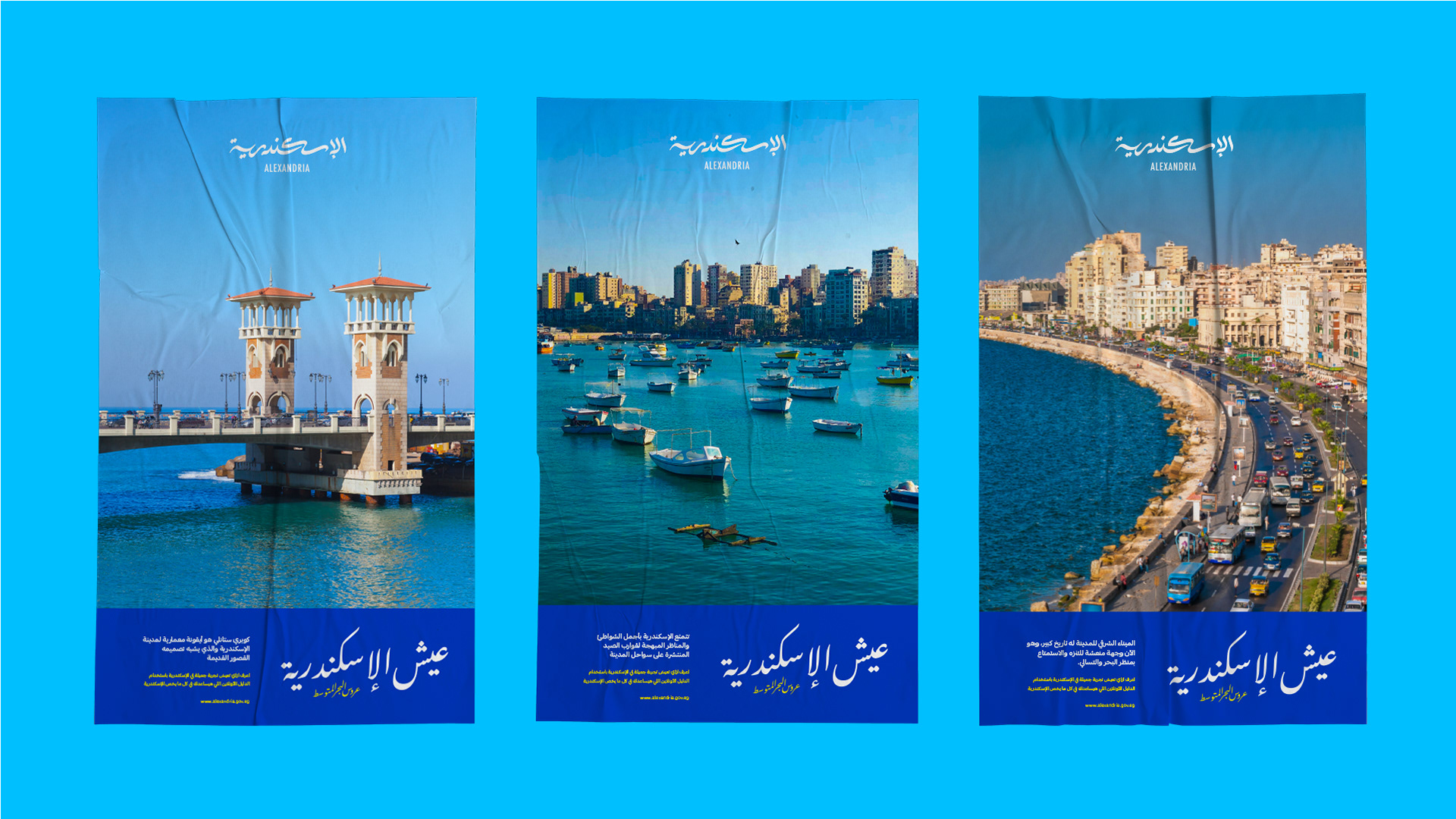
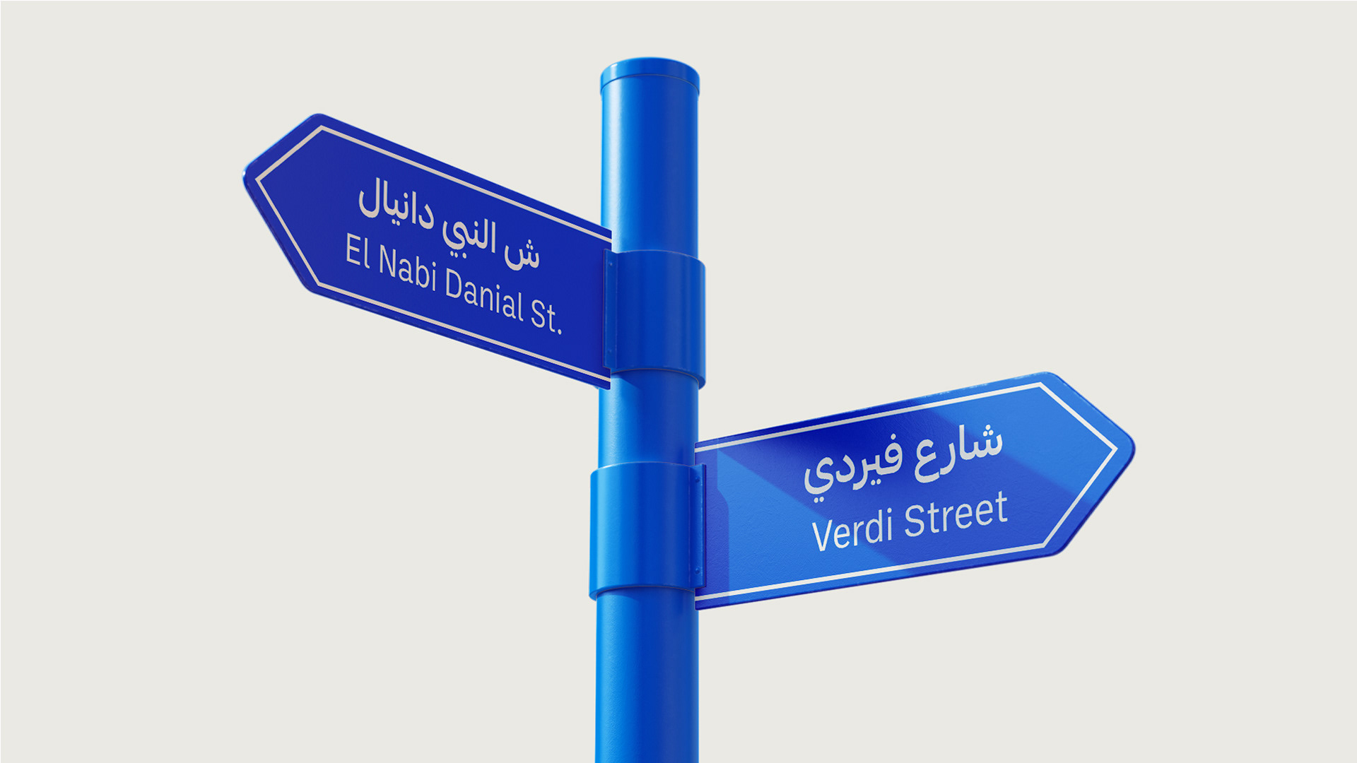
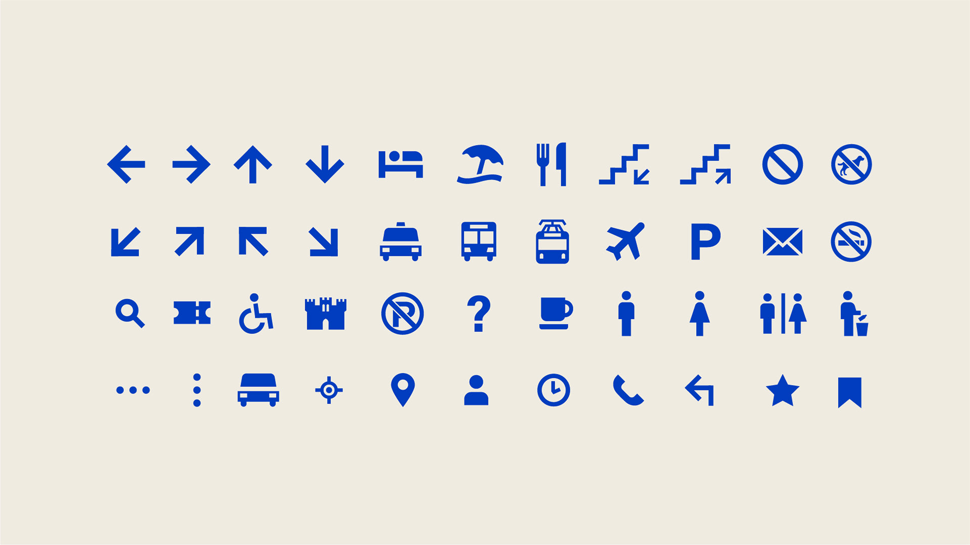
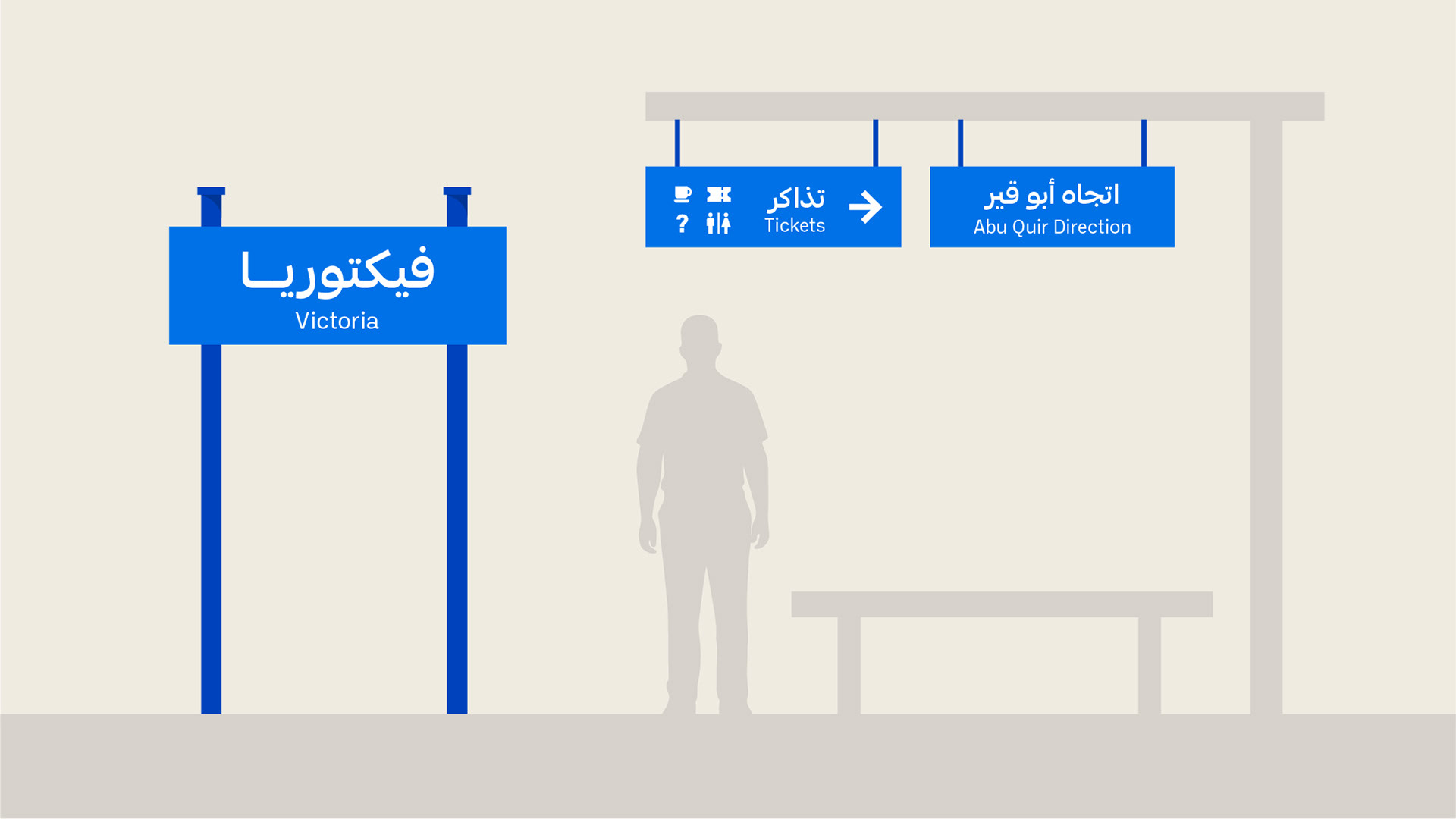
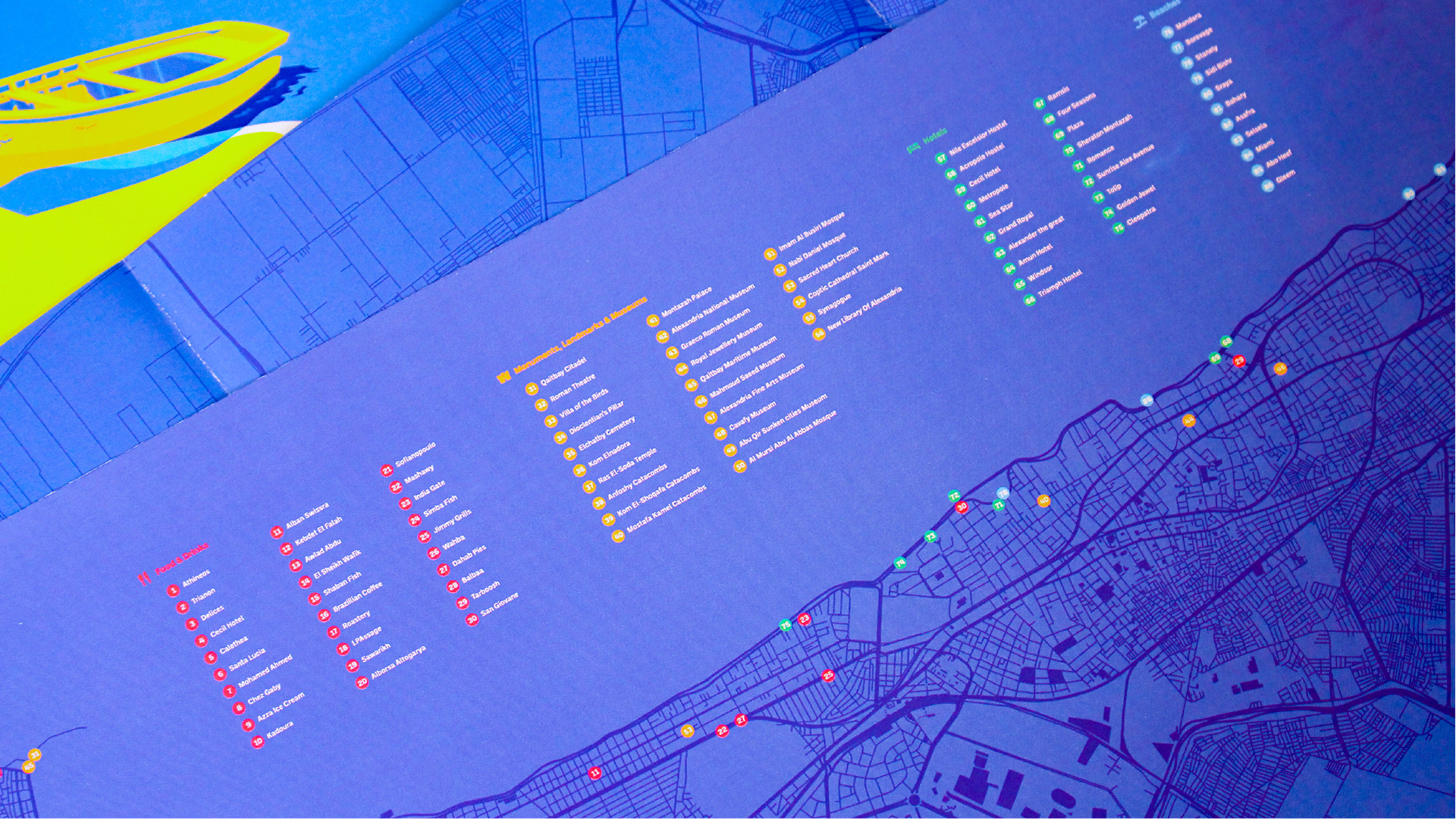
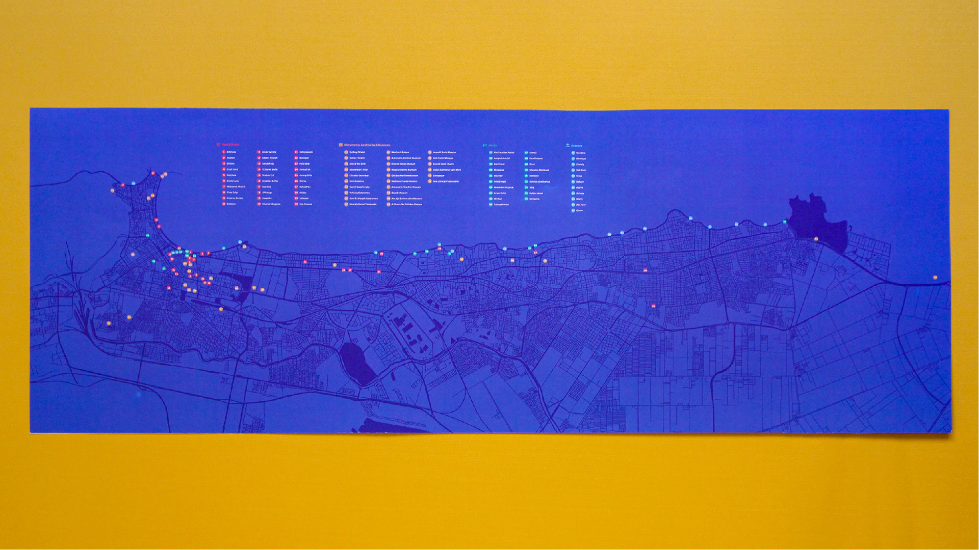
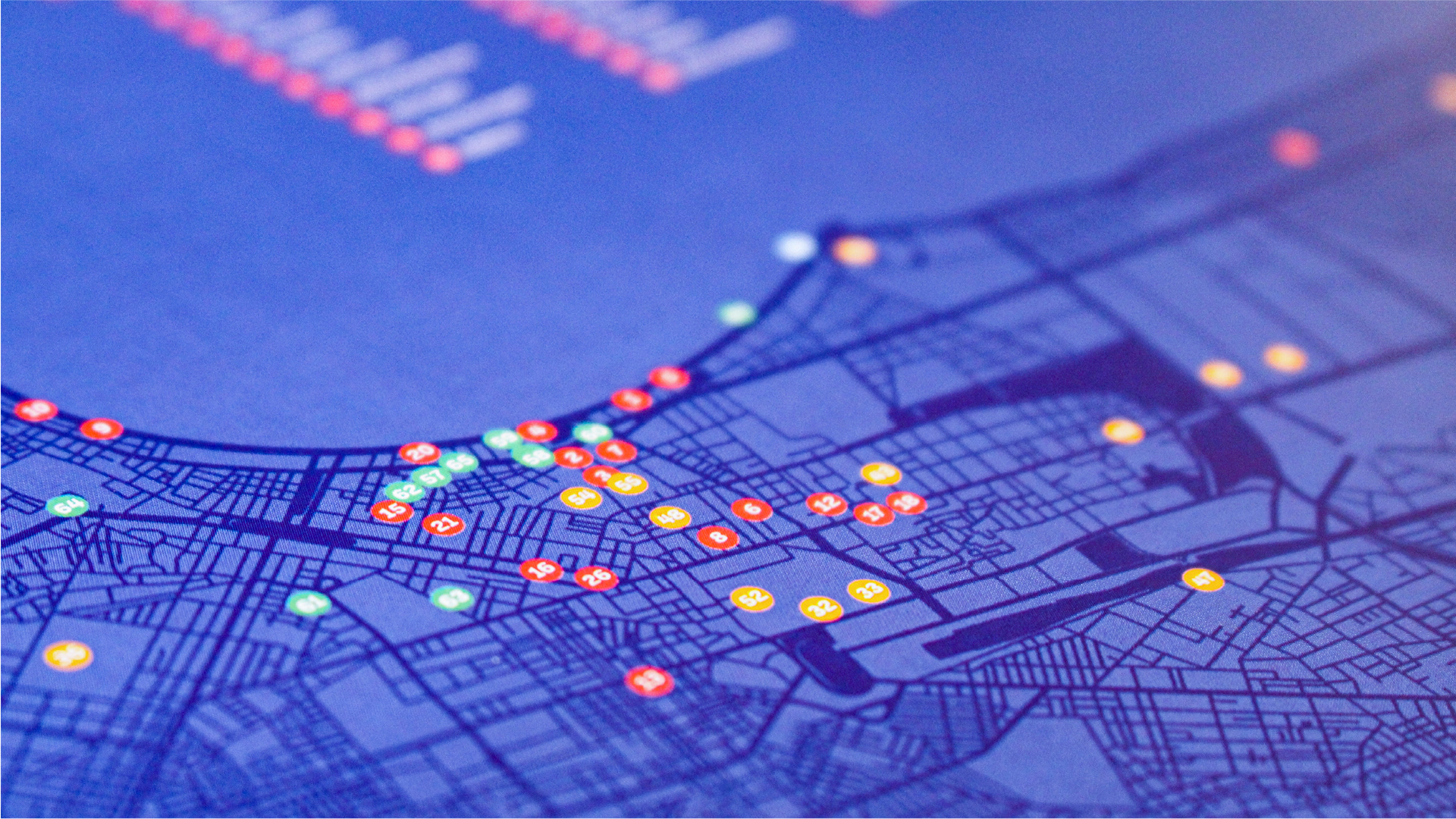
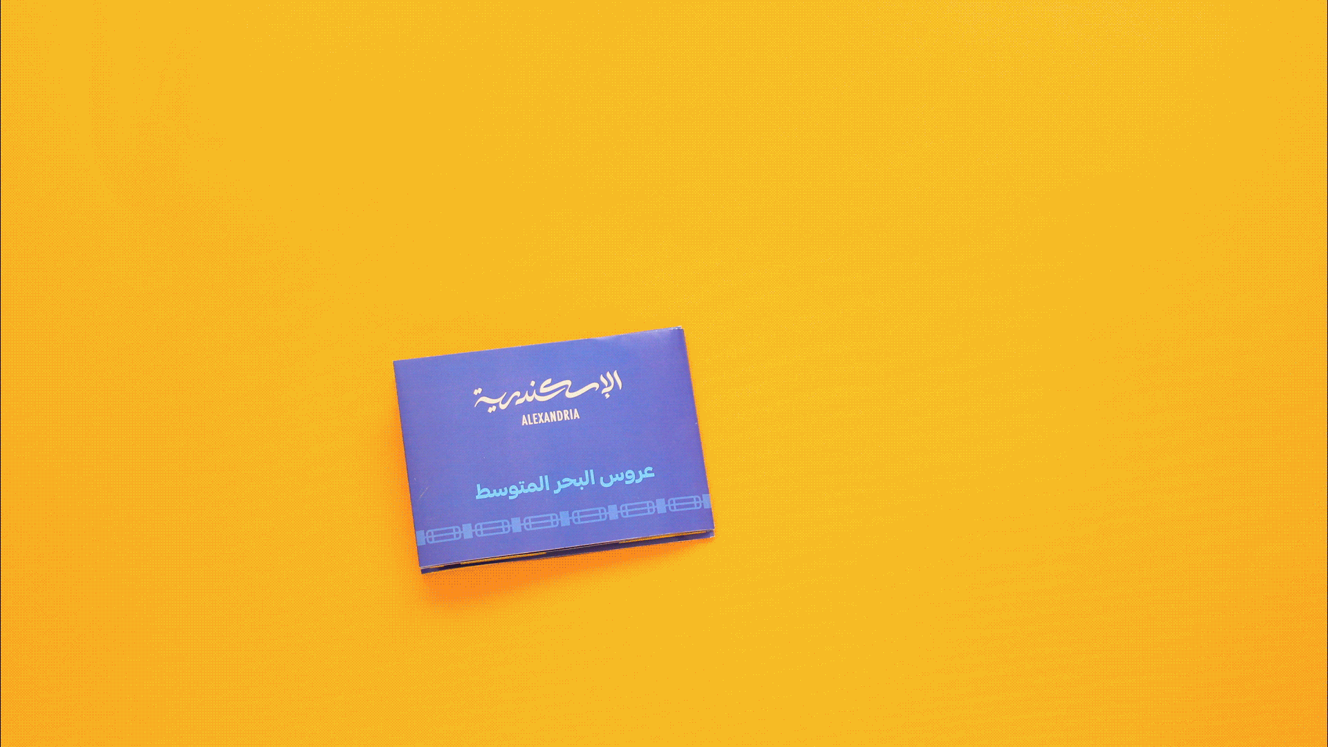
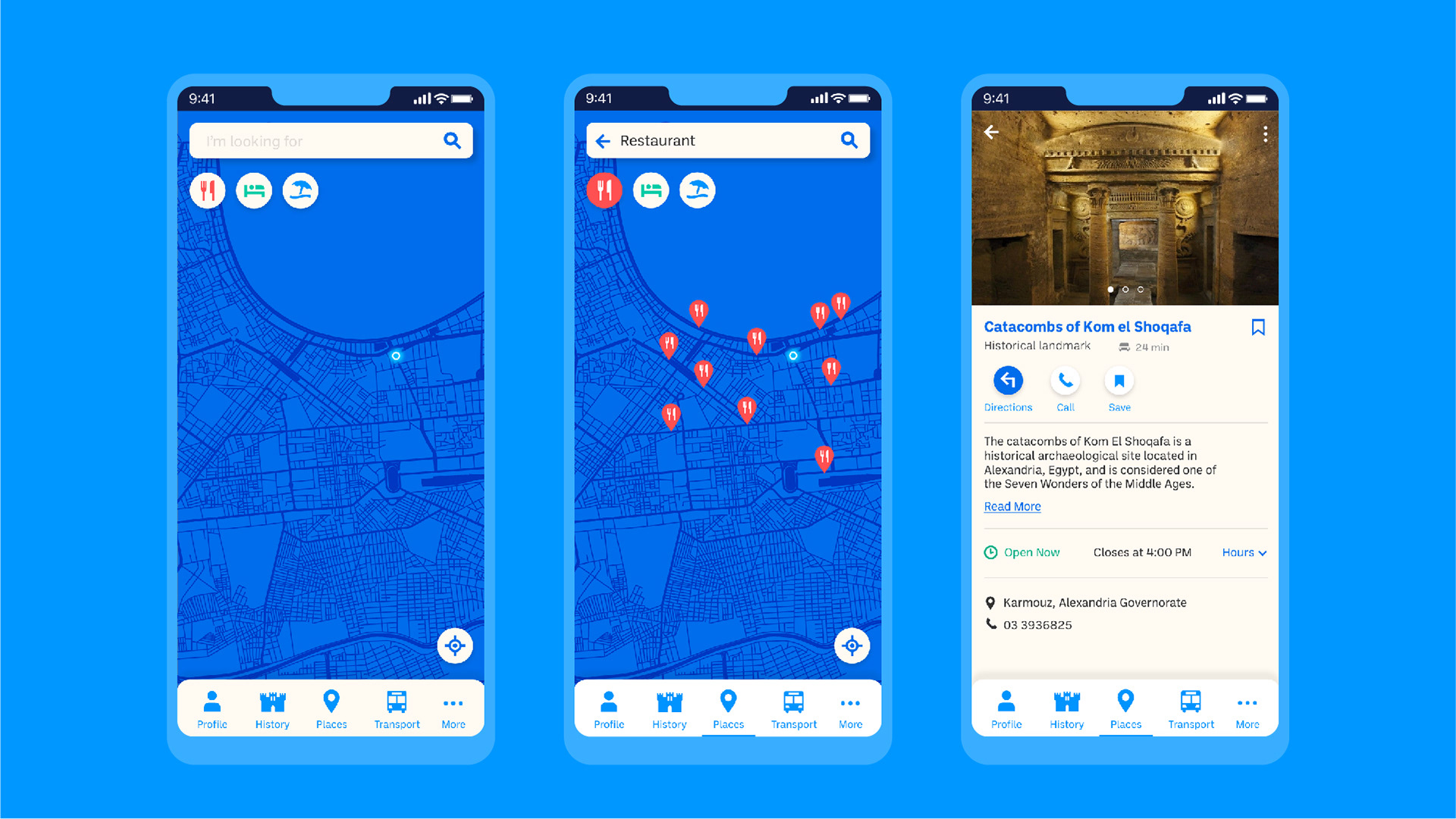
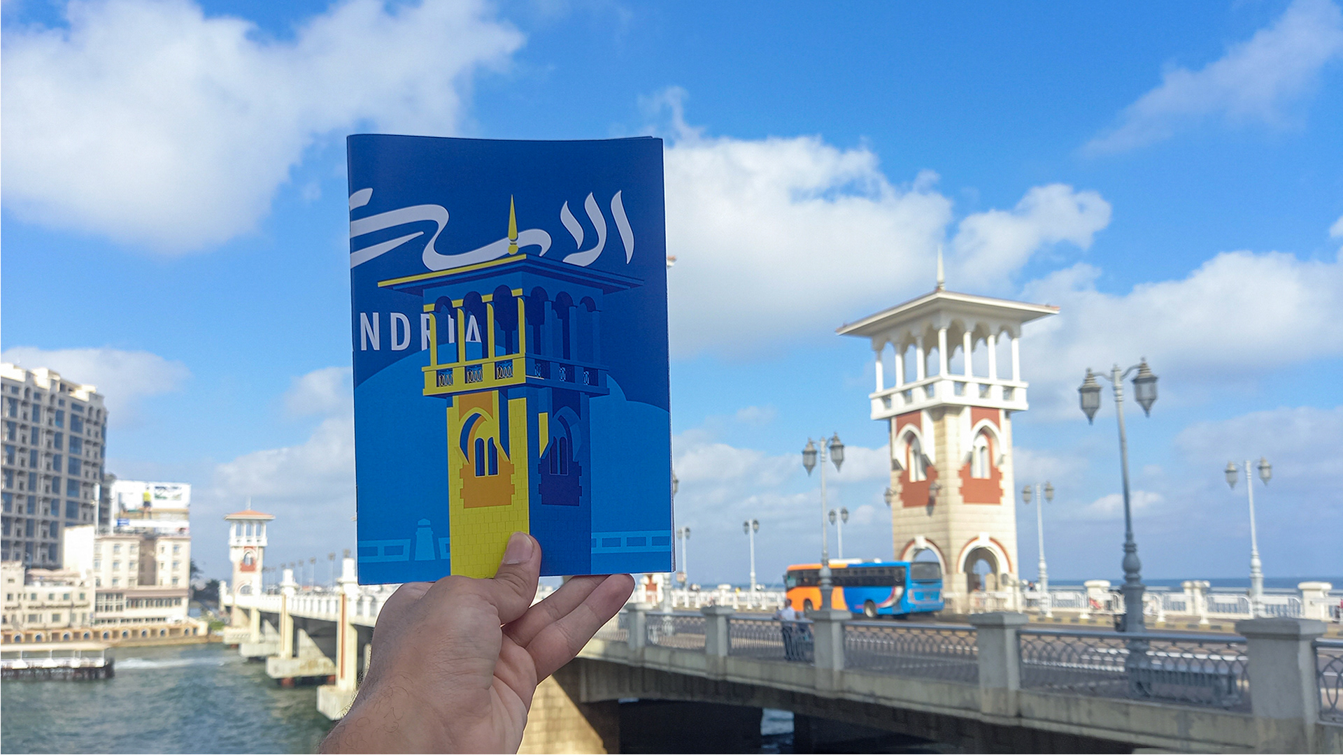
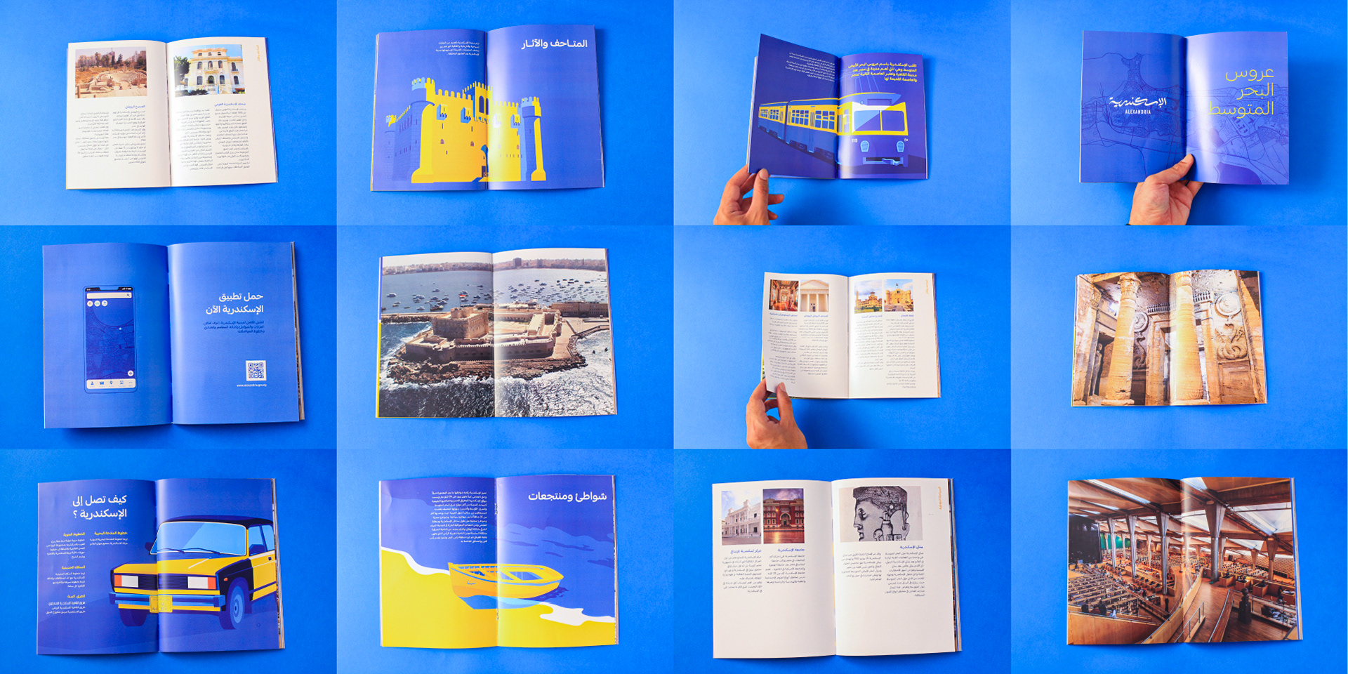
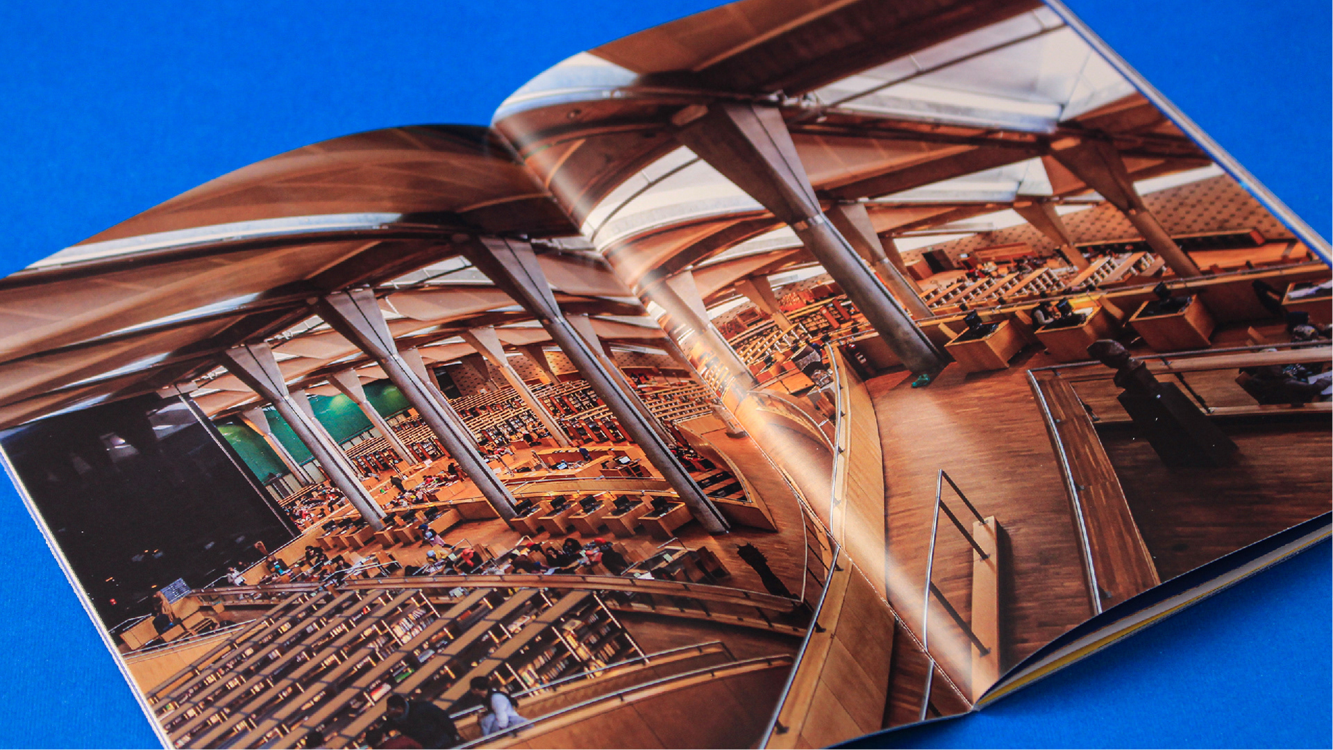
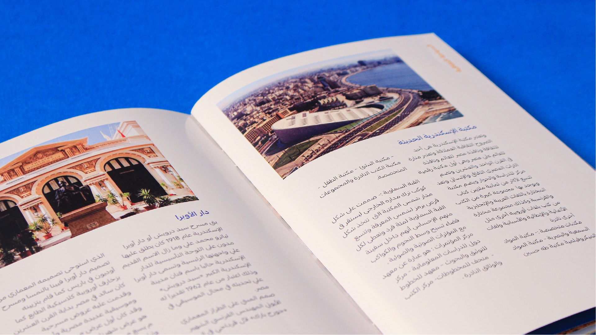
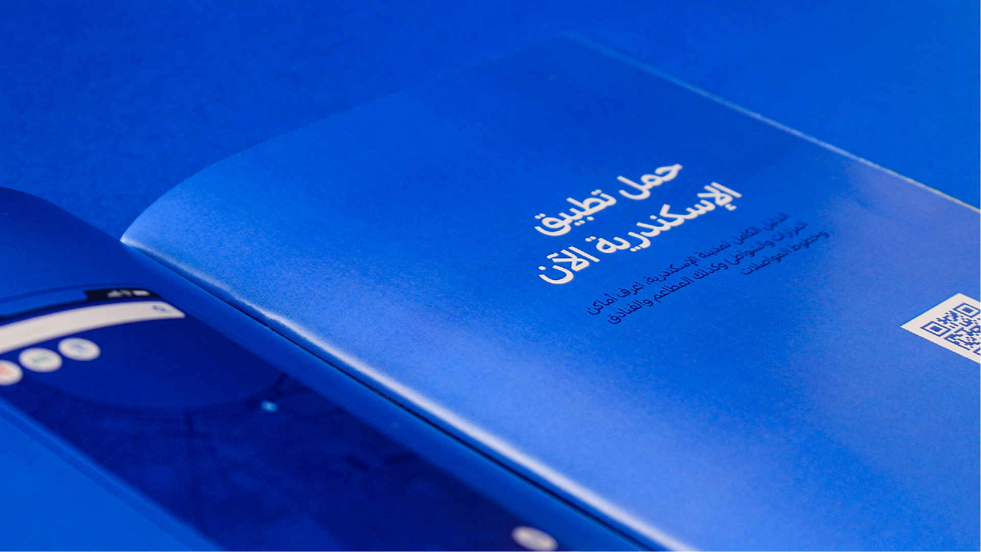
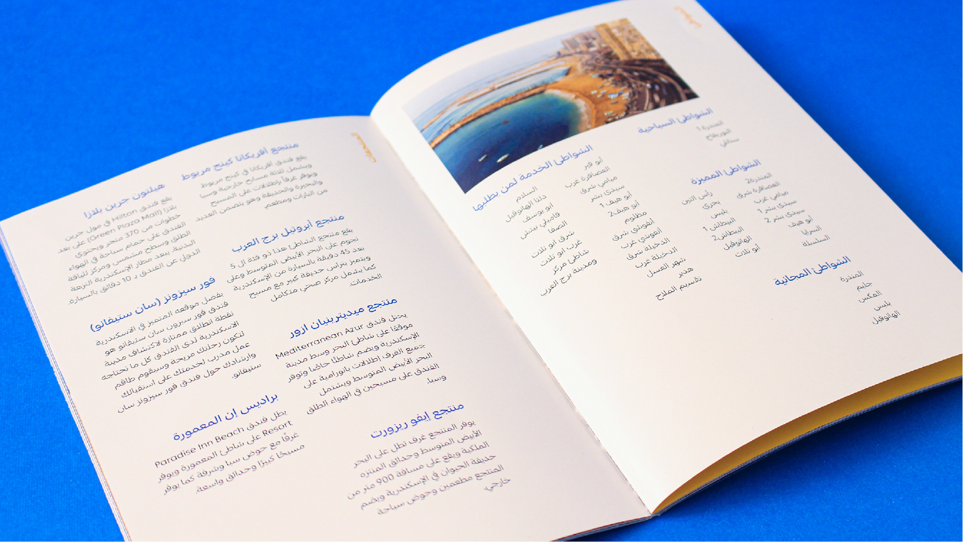
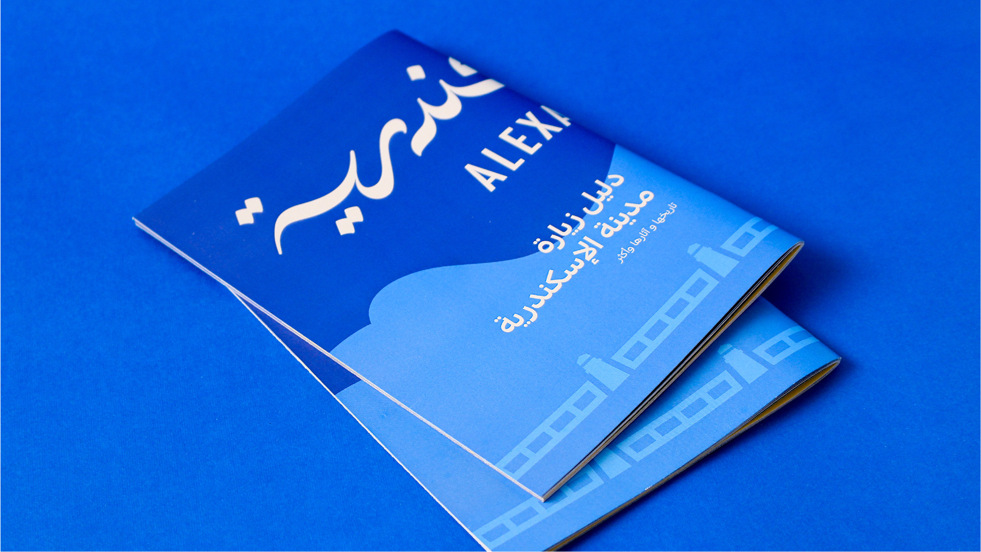
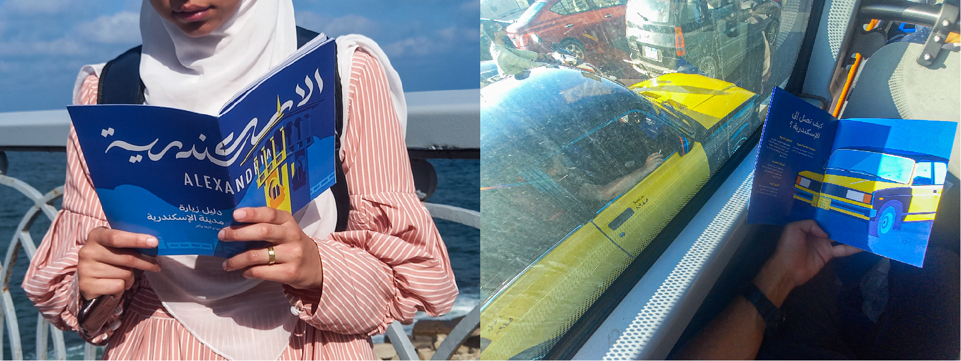
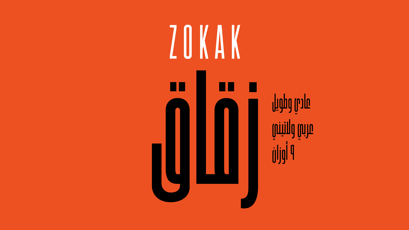
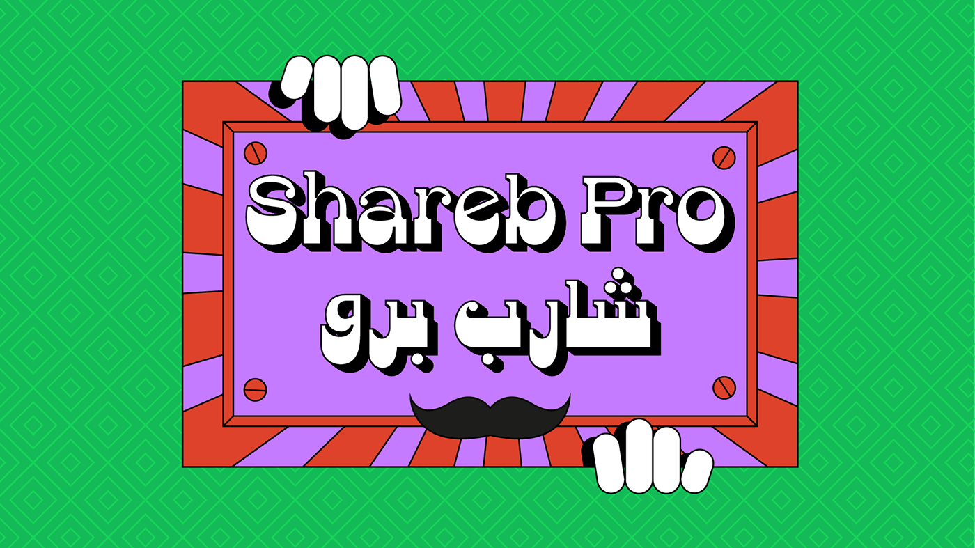
After that, we applied the identity on all the touchpoints needed, designing printings, tourist guides, App Ui, digital communication style, icon set, etc.
After that, we applied the identity on all the touchpoints needed, designing printings, tourist guides, App Ui, digital communication style, icon set, etc.